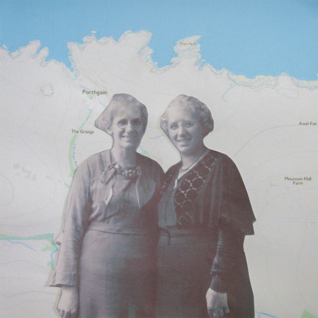
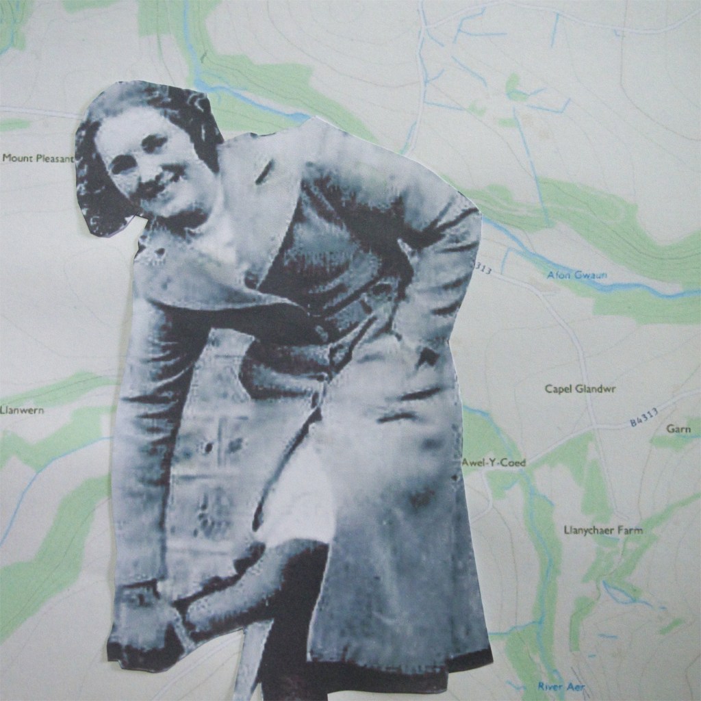
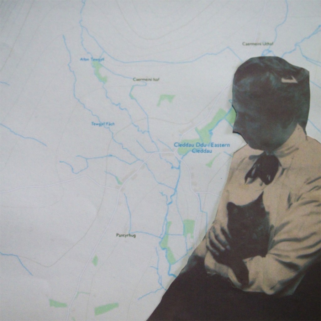
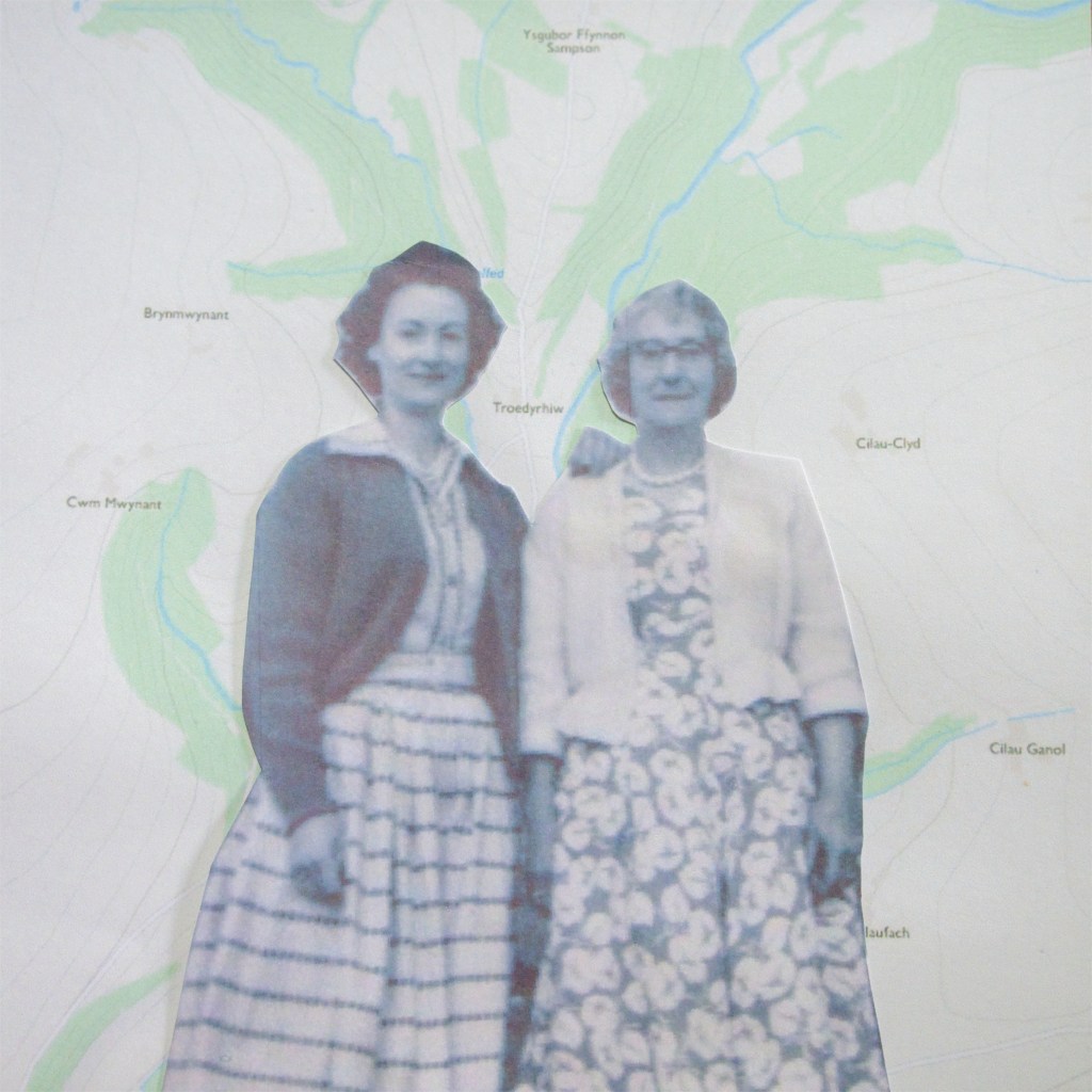
Mapping
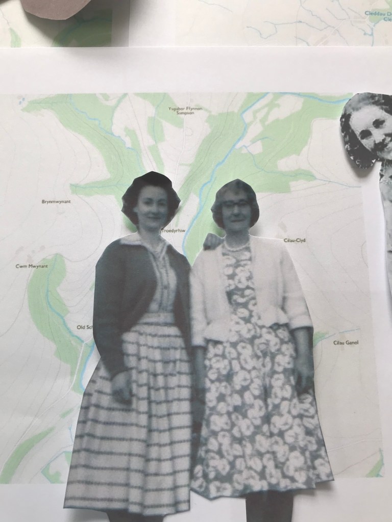
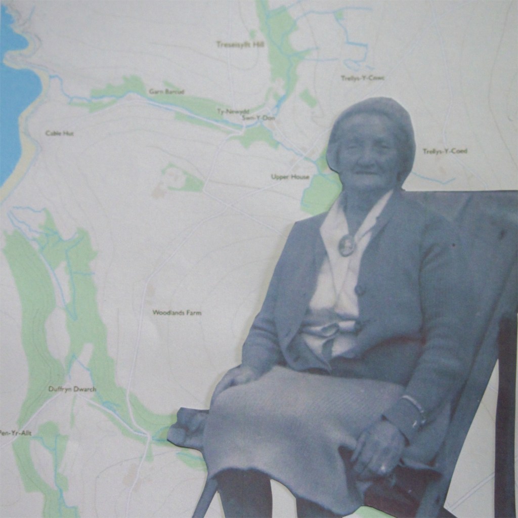
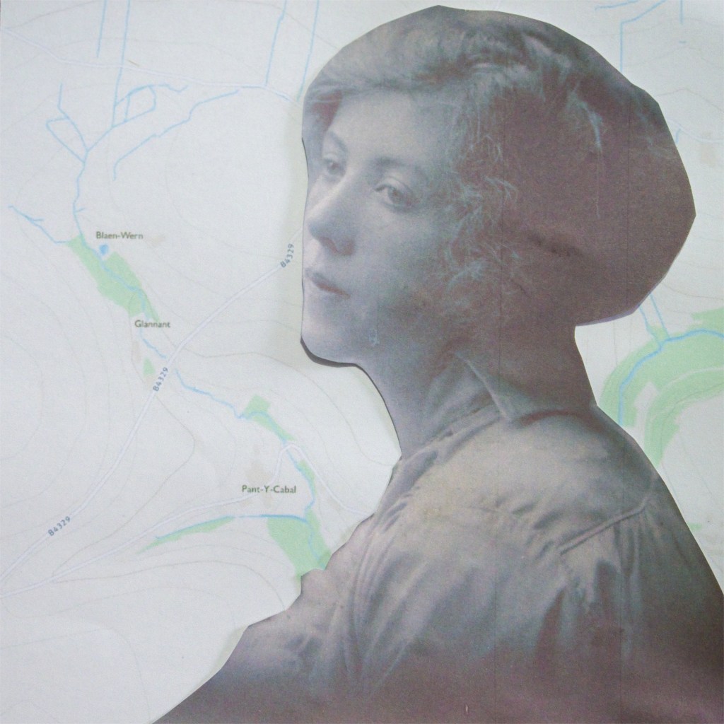
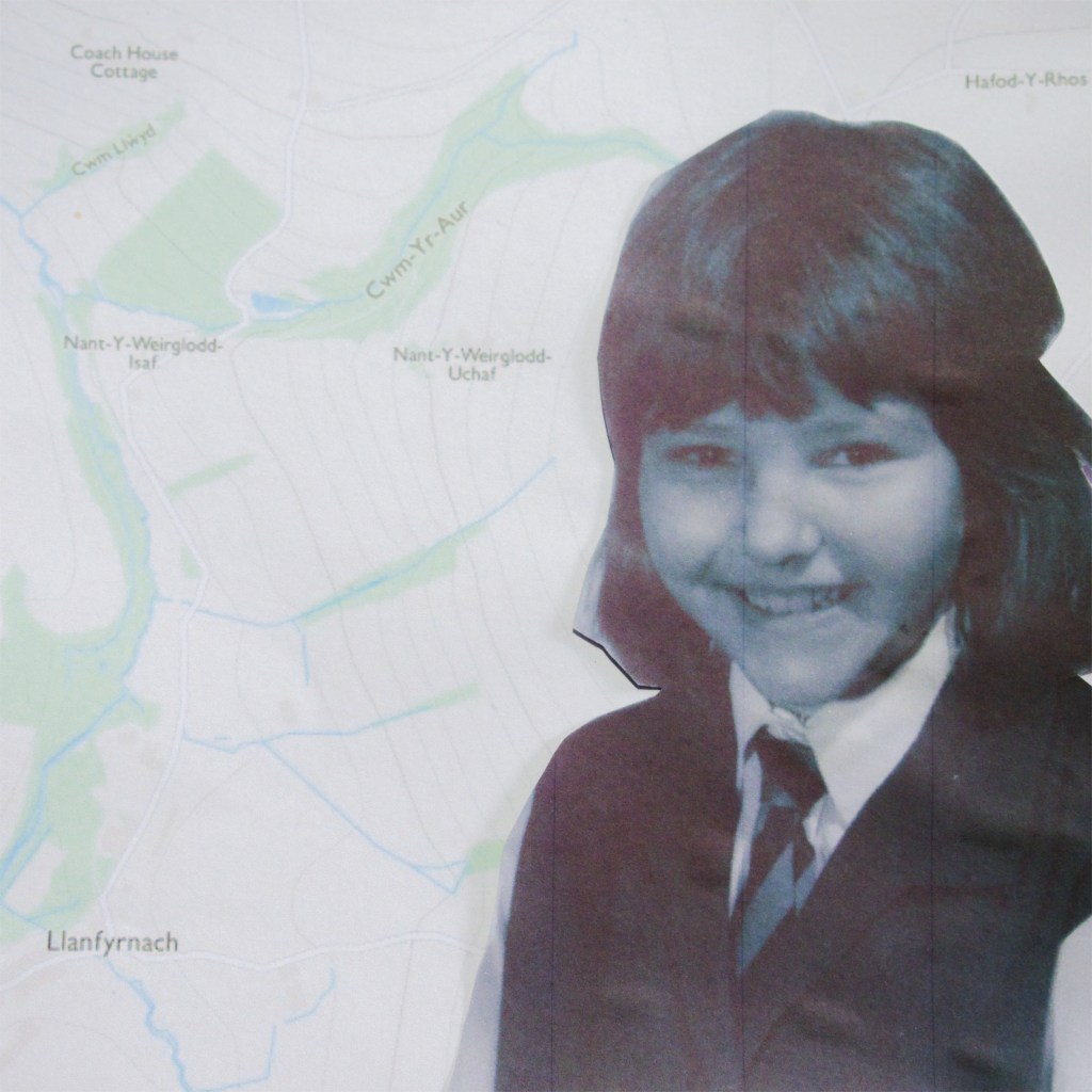
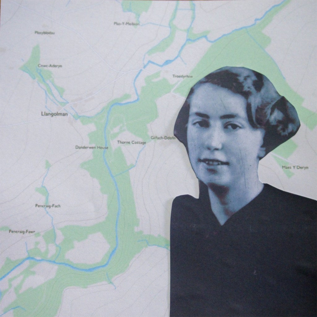
After I decided on using mapping, I began experimenting with combining the maps and the archive images. I wanted to give the impression that the women are on the journey with me. However they are not in the main images, inferring they are excluded, which keeps to the theme of gender inequality.
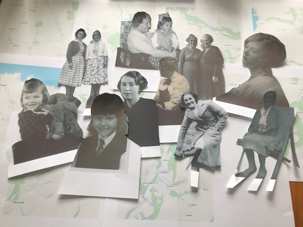
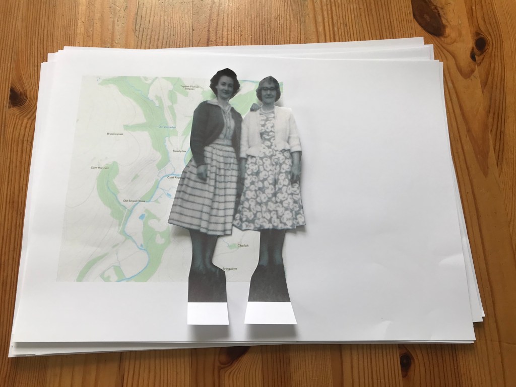
I have printed and cut out the images of women:
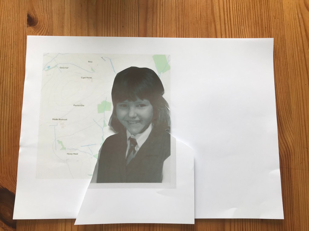
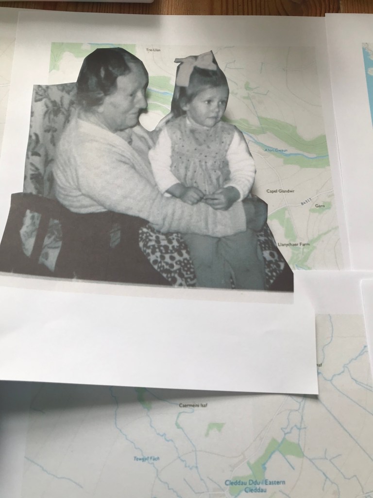
Here is one with a colour map:
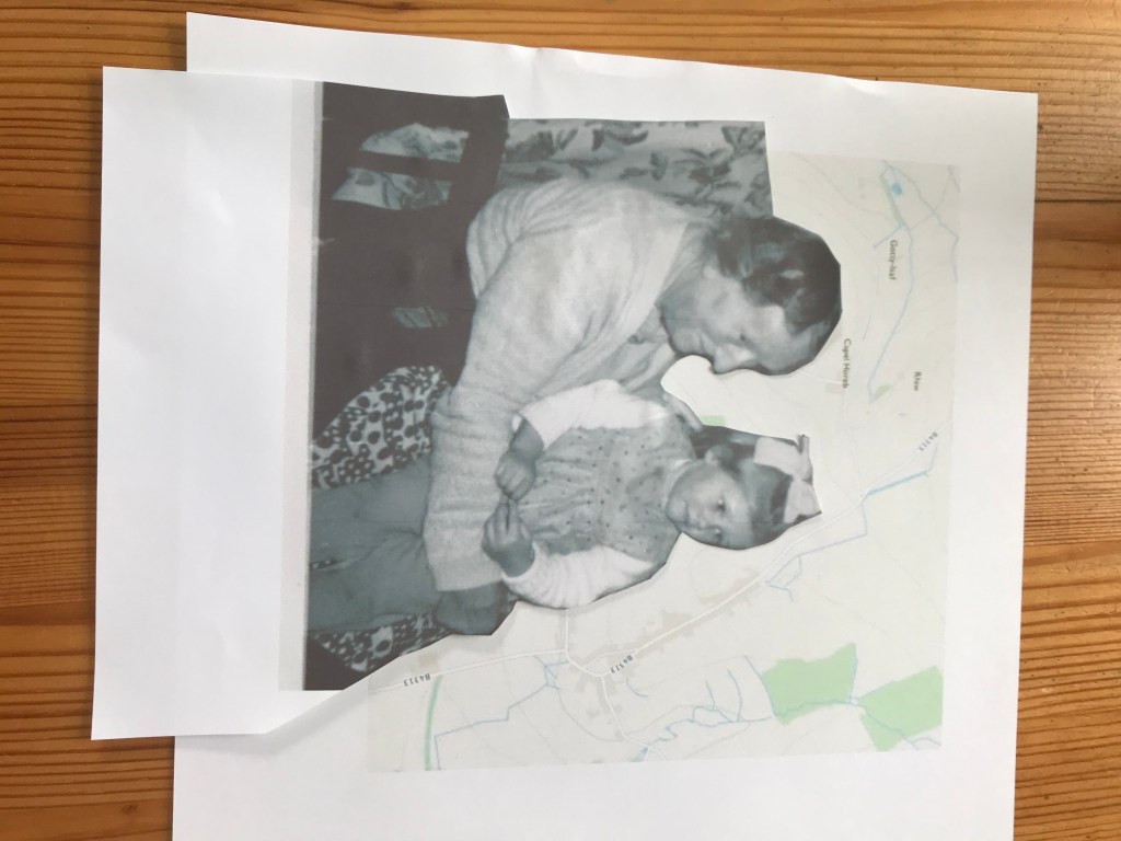
Here is one with the black and white map:
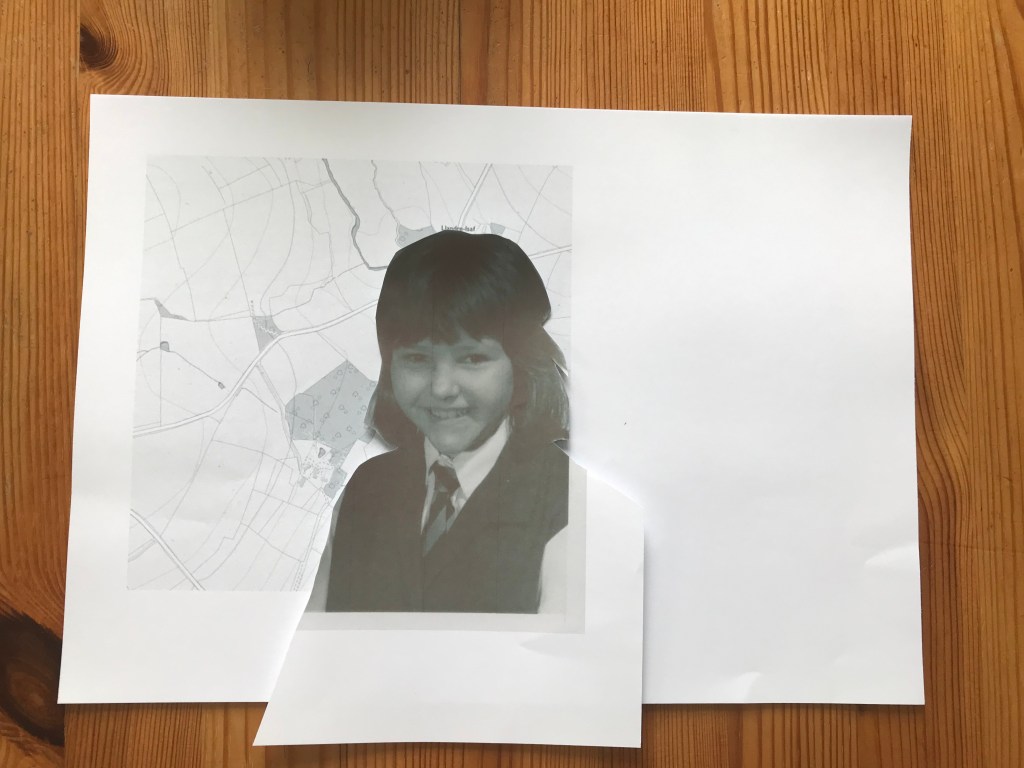
Whilst the black and white images looks good, I think the colour map looks better. It shows better contrast between the two elements. The little bit of colour from the map, really makes the image stand out.
I then tried moving them around and rearranging to see which went best:
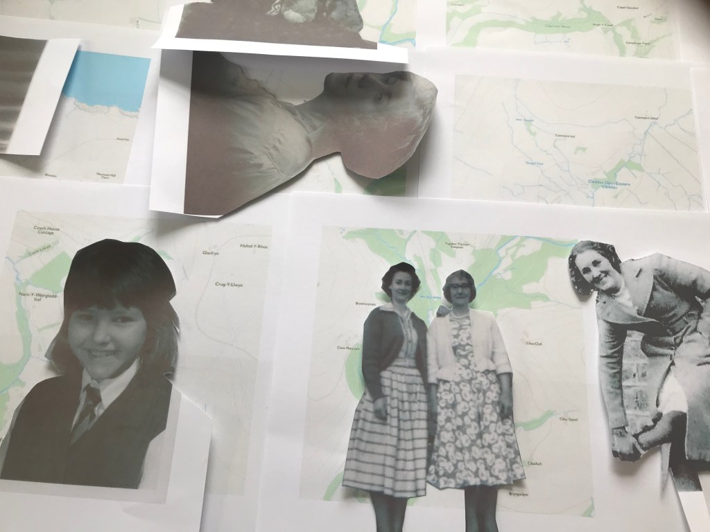
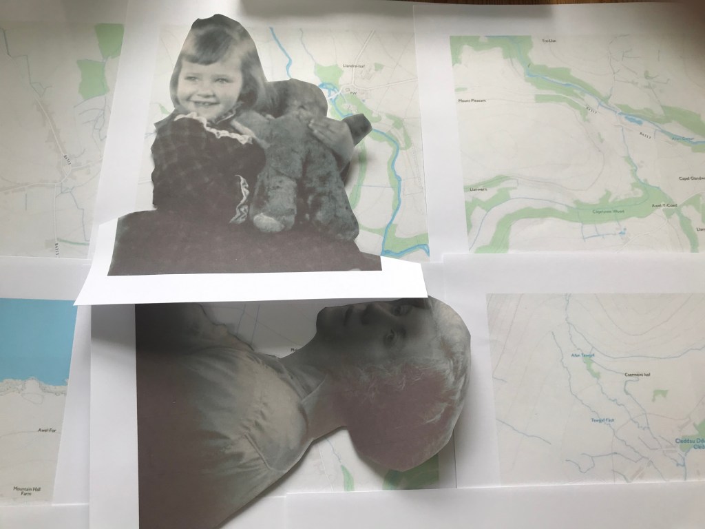
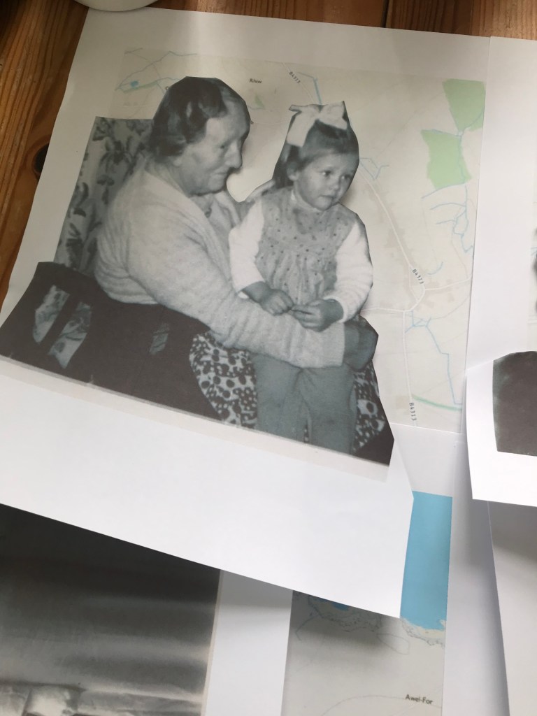
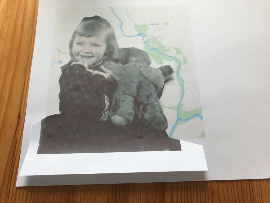
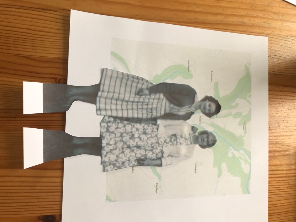
I then stuck the images together, cut them out and re-photographed them. Here are the eight finished images that I have chosen to use in my assignment:
Update:
These above are the original one I made for a previous assignment, I have now reprinted and redone them for the final assignment, here they are:
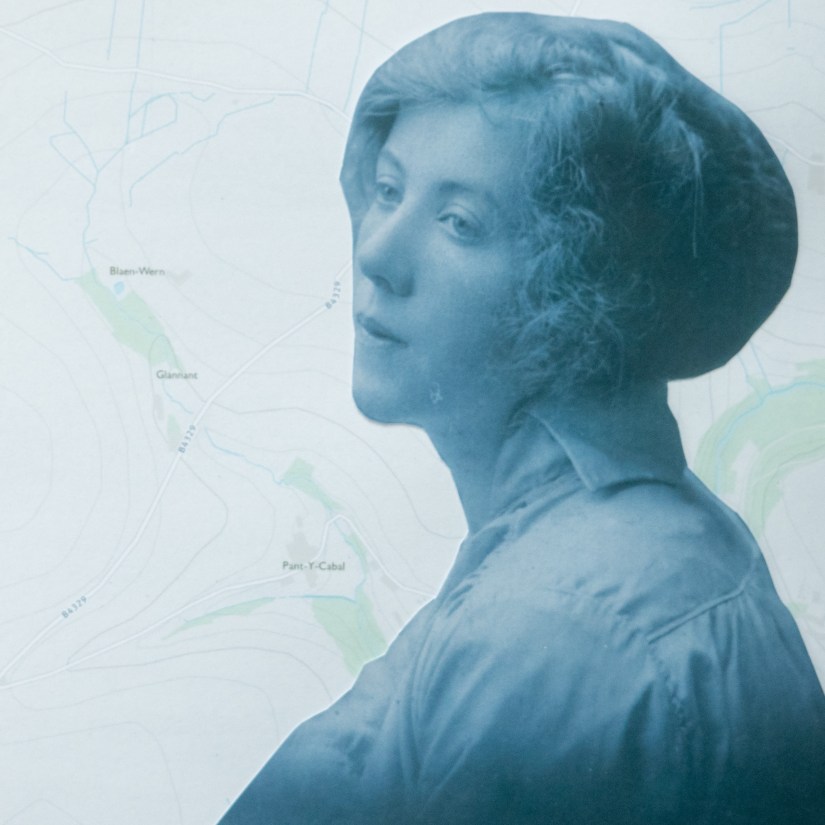
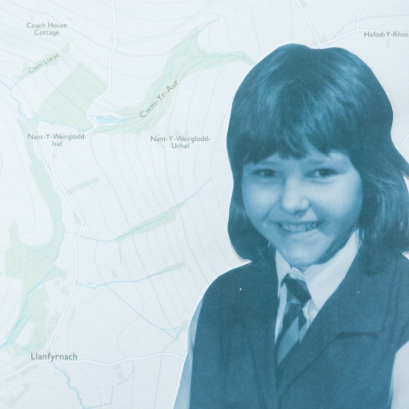
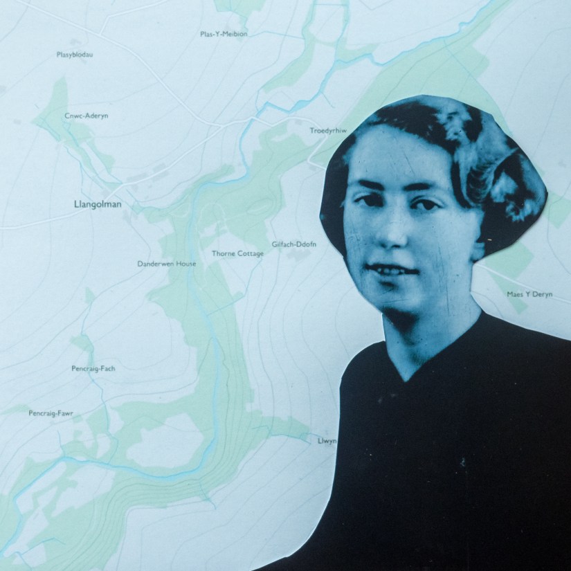
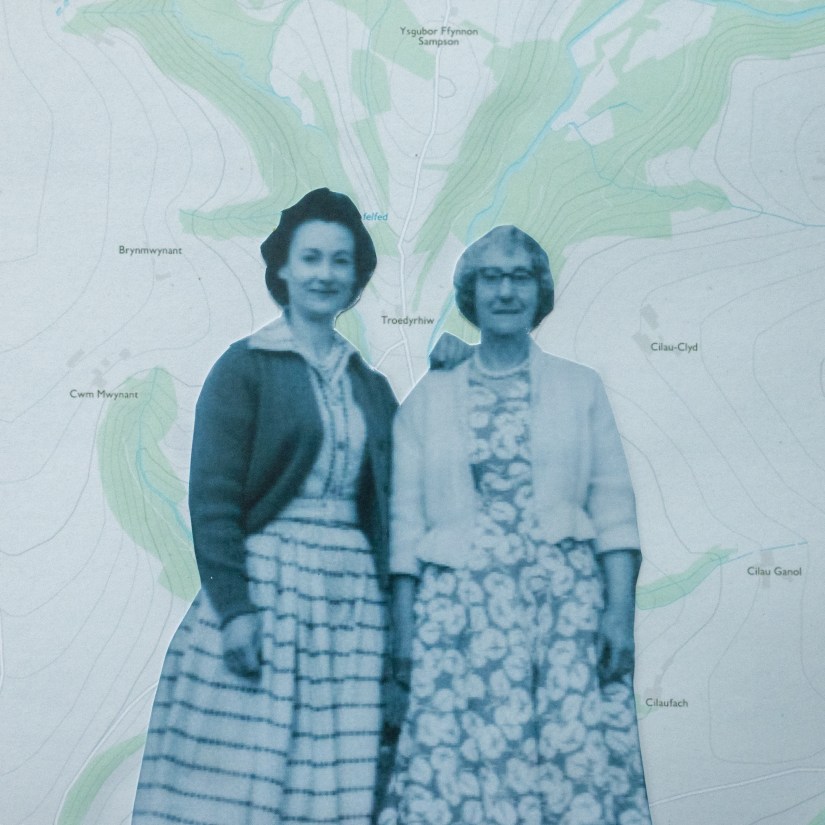
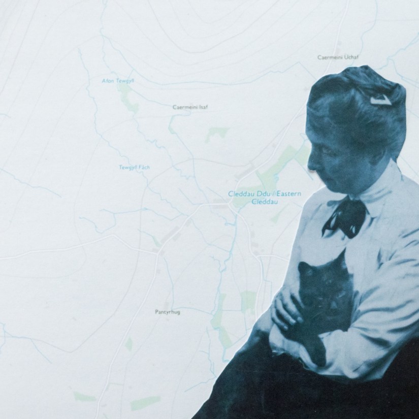
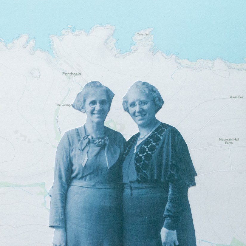
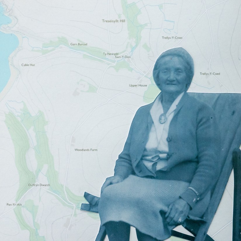
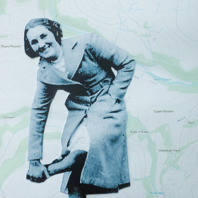
The finish on these images is better. The print quality of the image as a whole is better and so is my cutting out technique.

8 thoughts on “Mapping”