This first draft of my introduction:
your young men shall see visions…
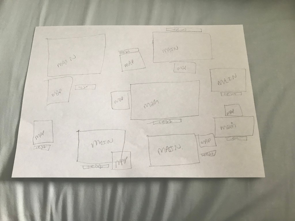
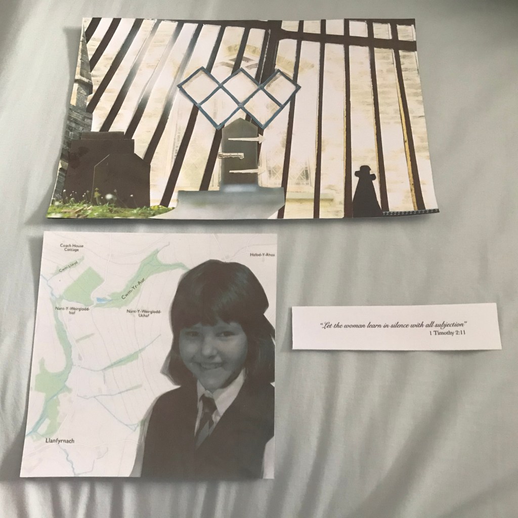
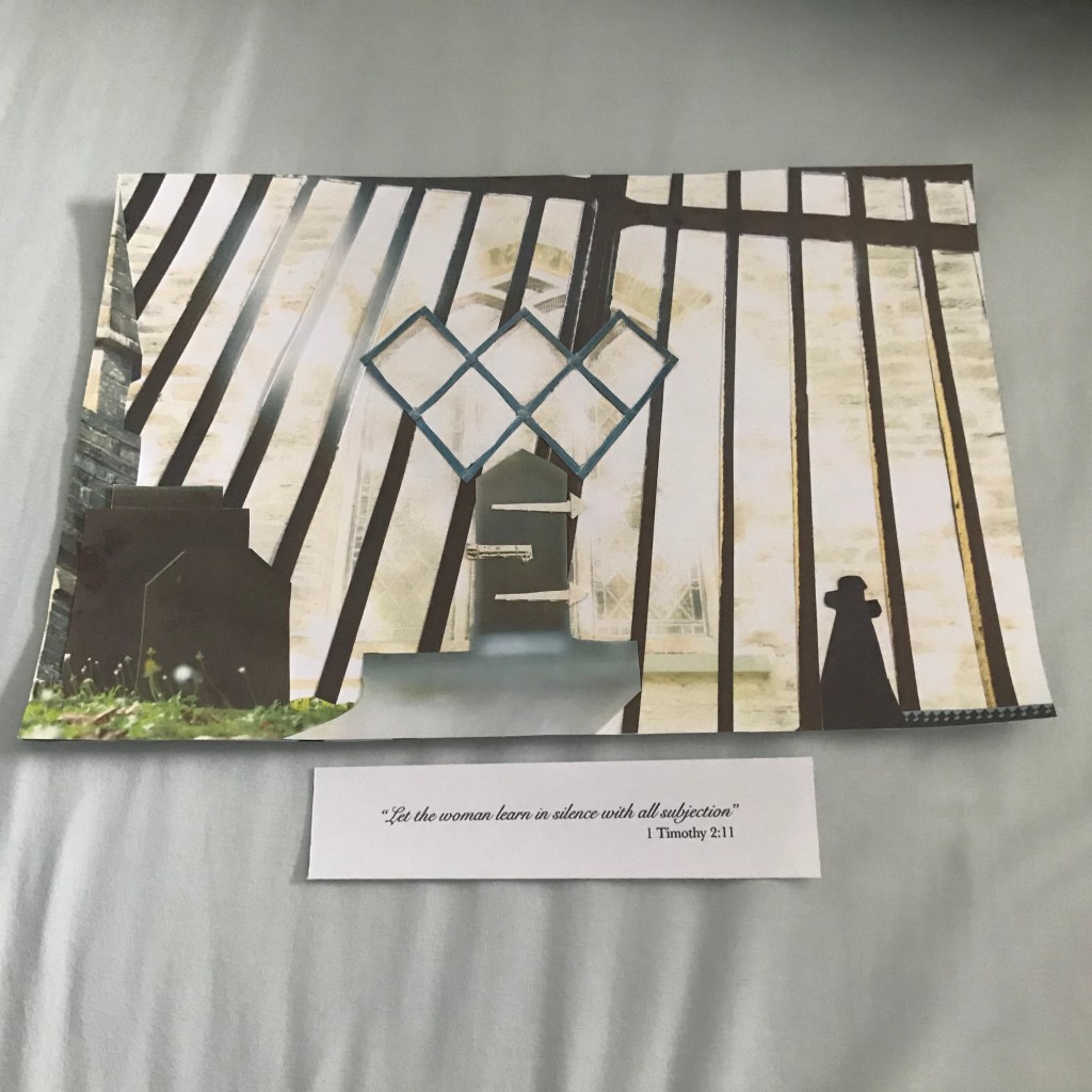
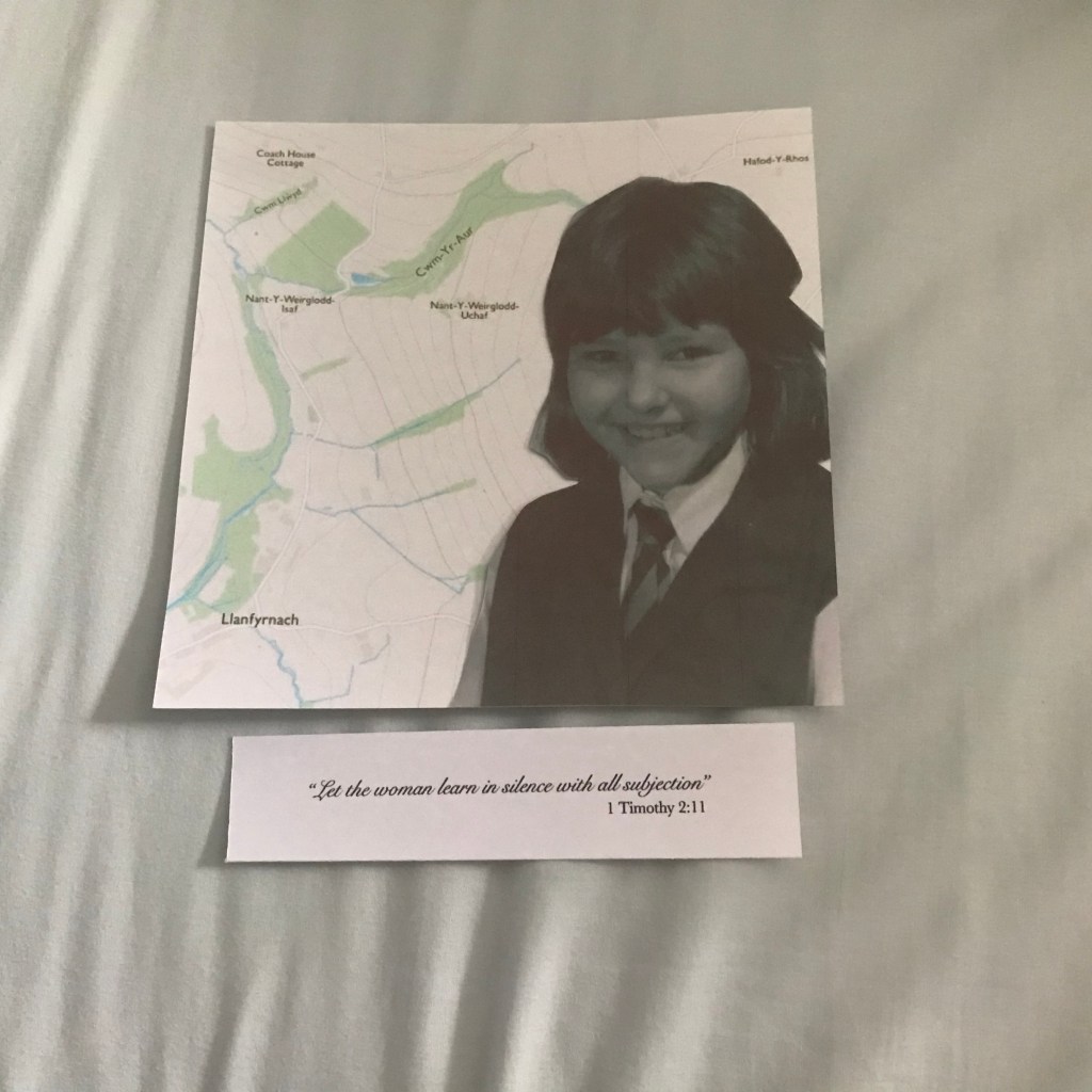
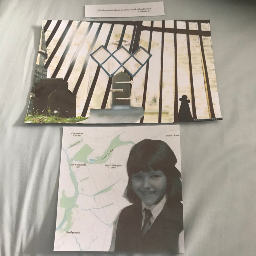
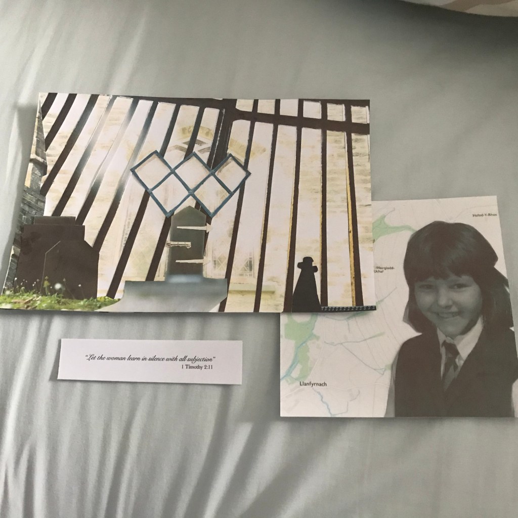
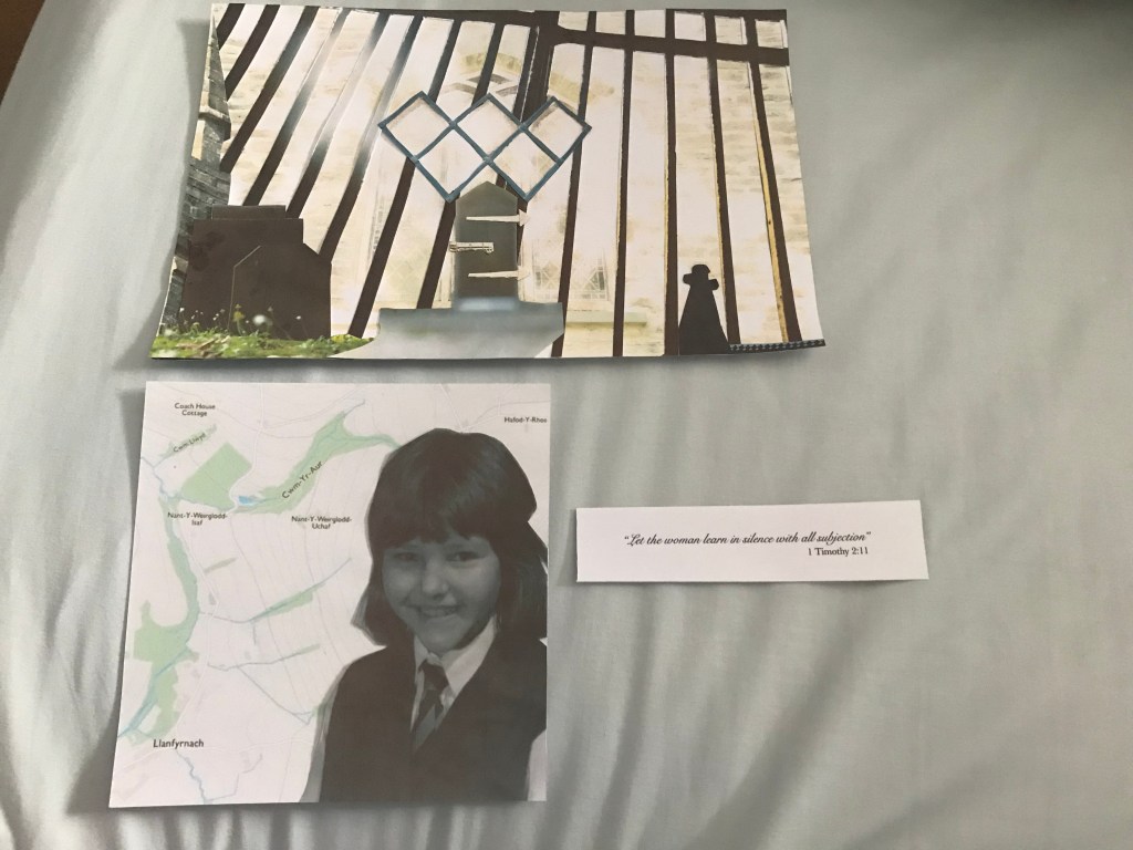
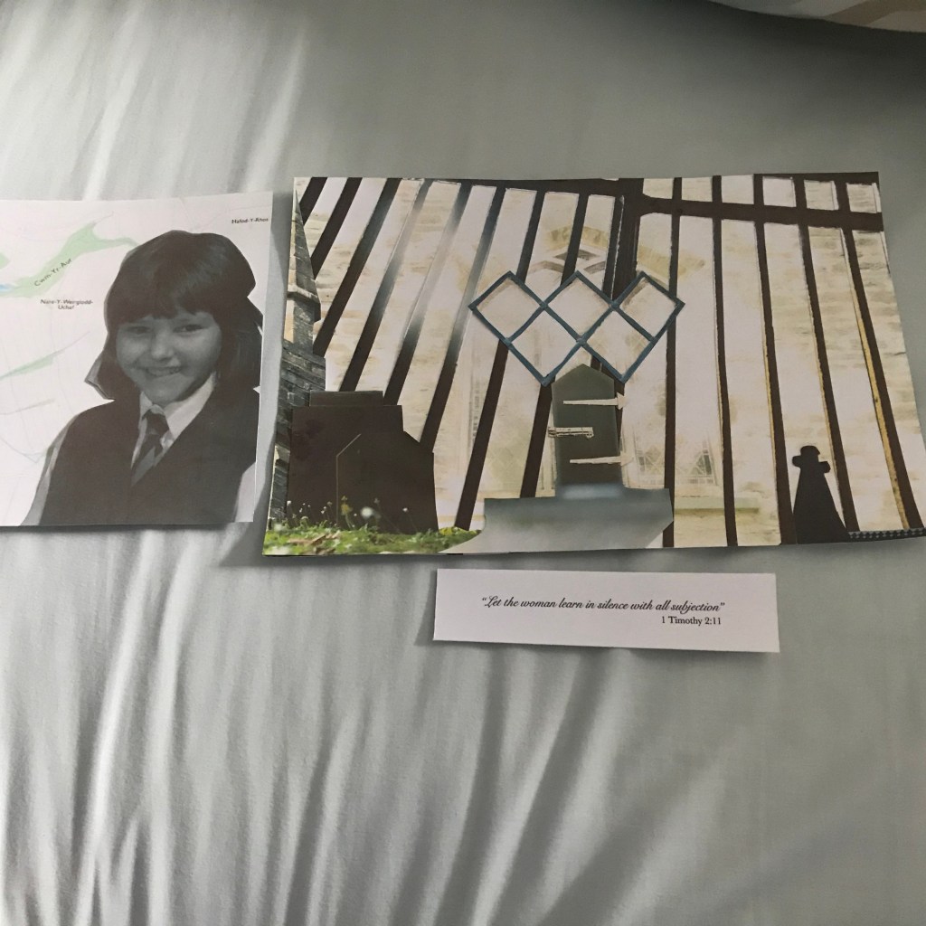
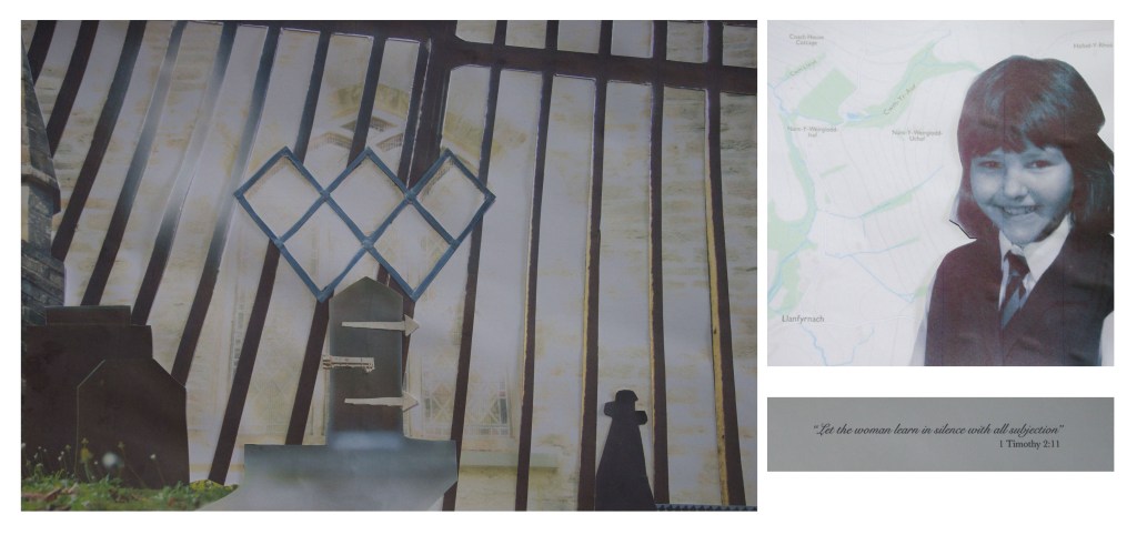
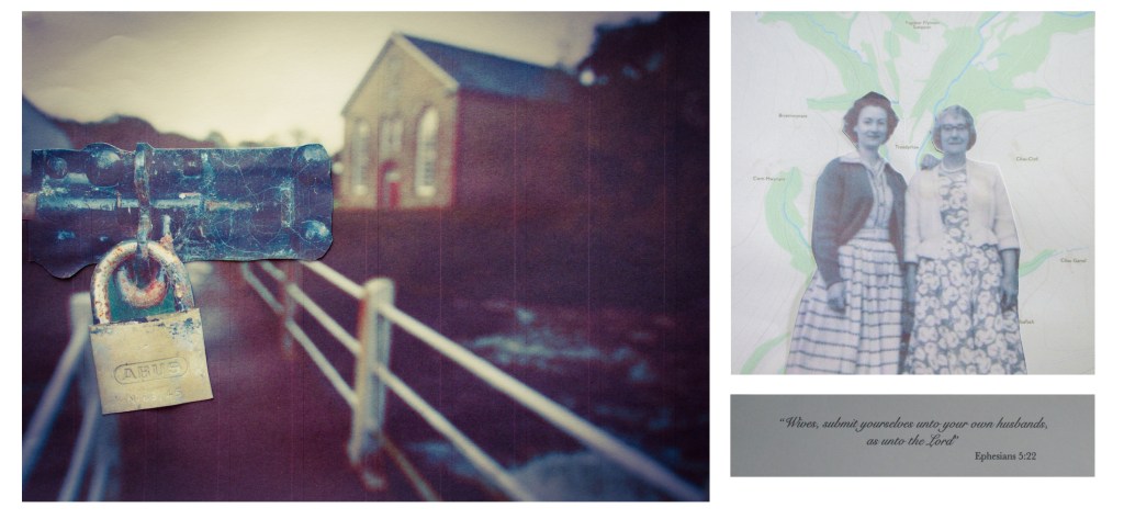
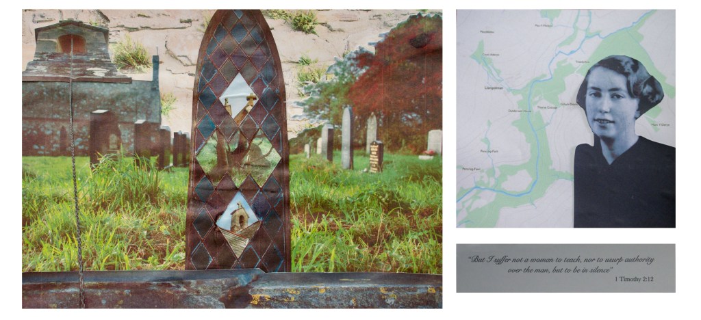
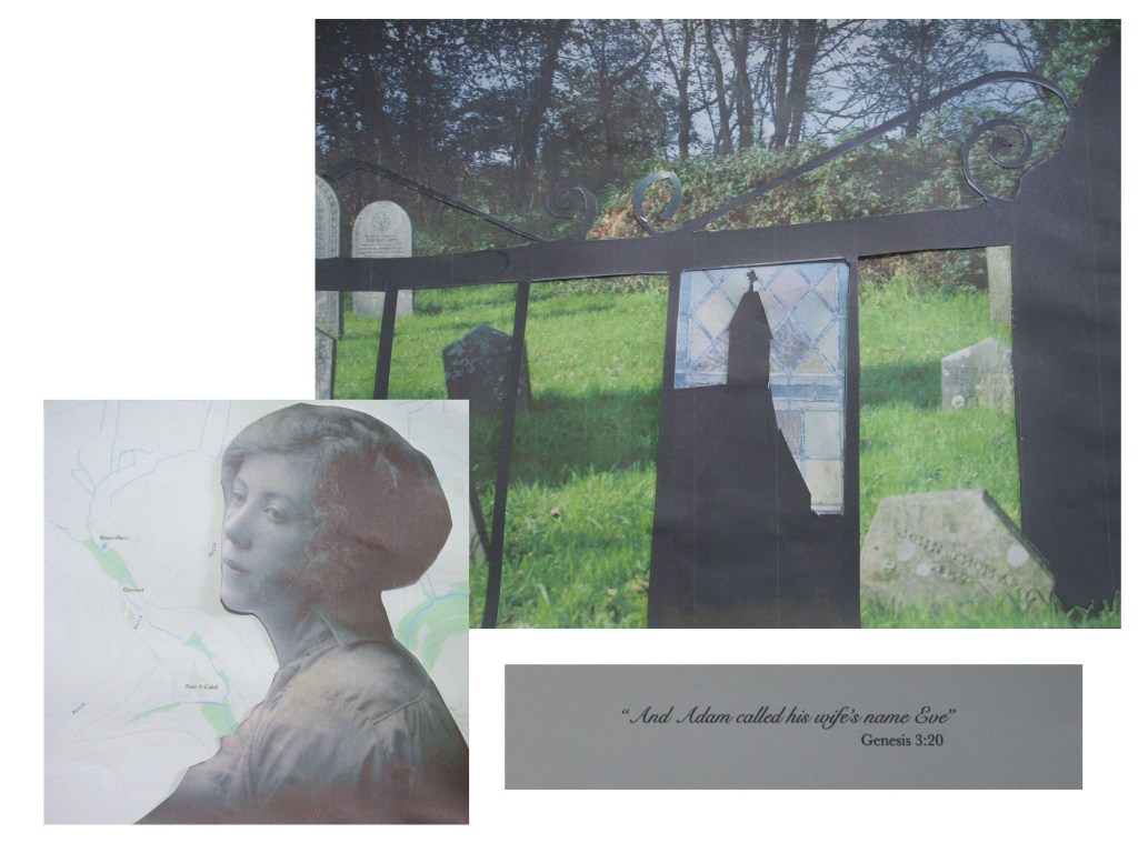
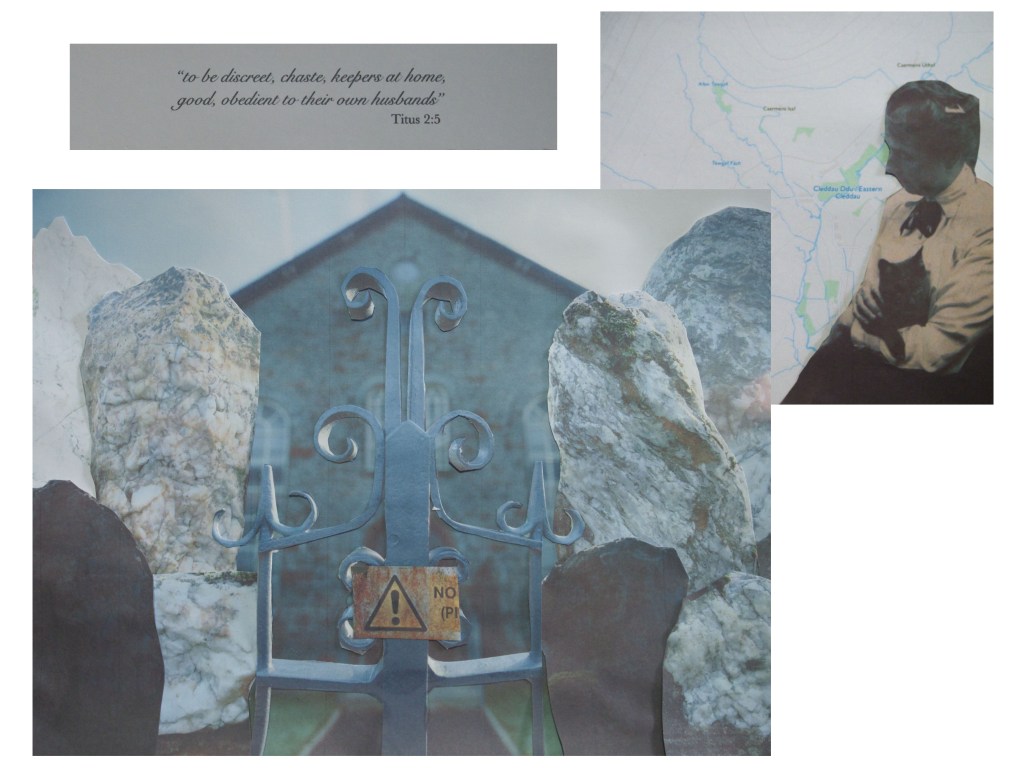
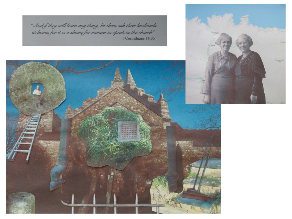
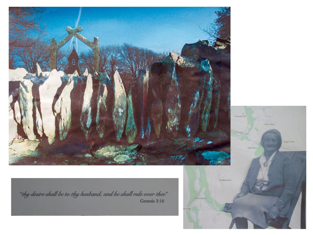
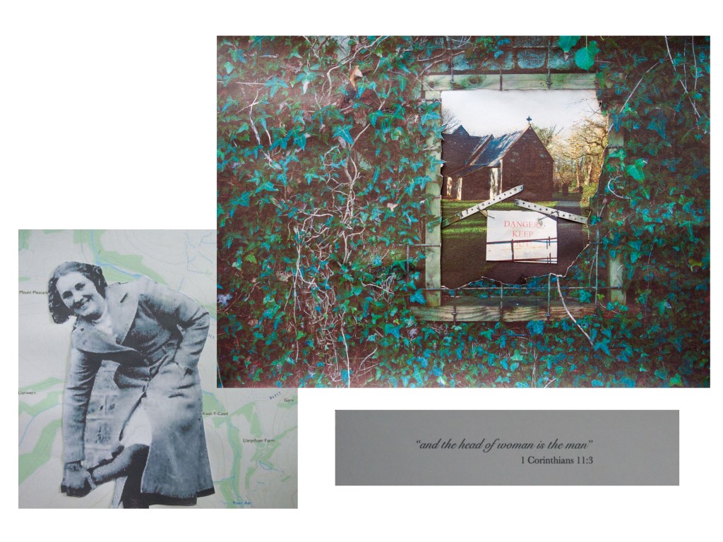
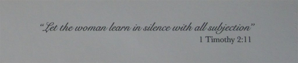
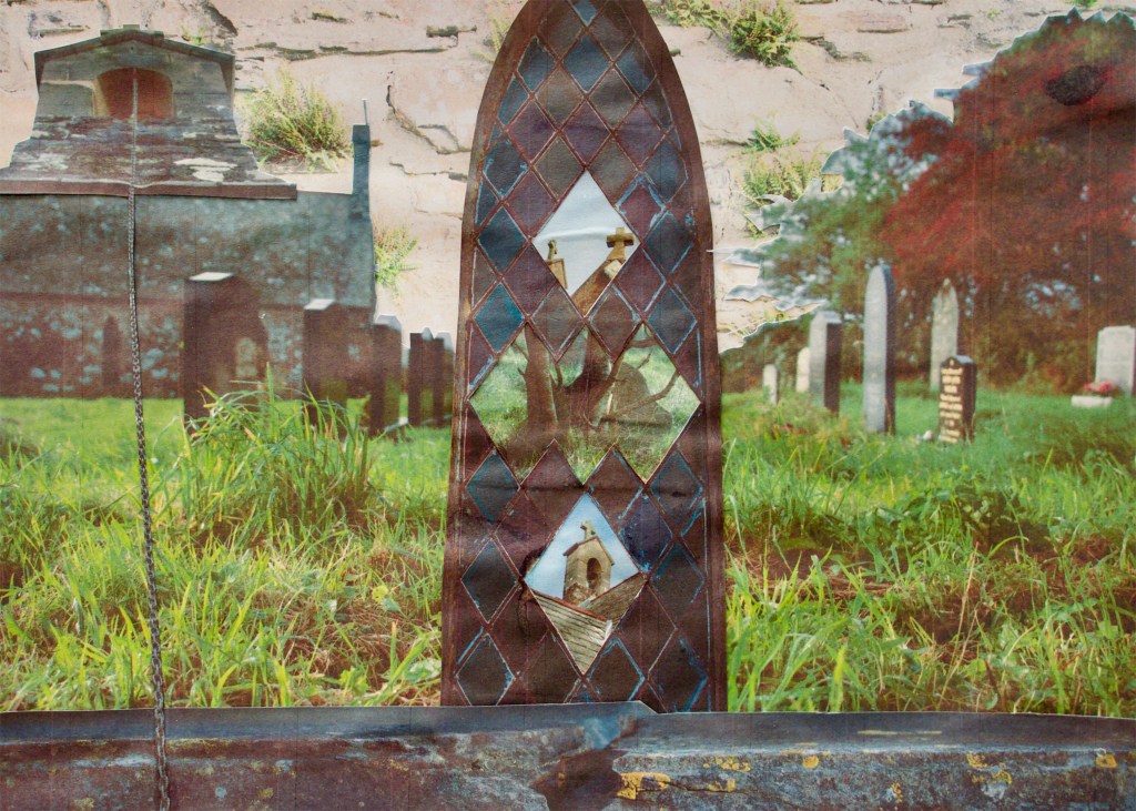
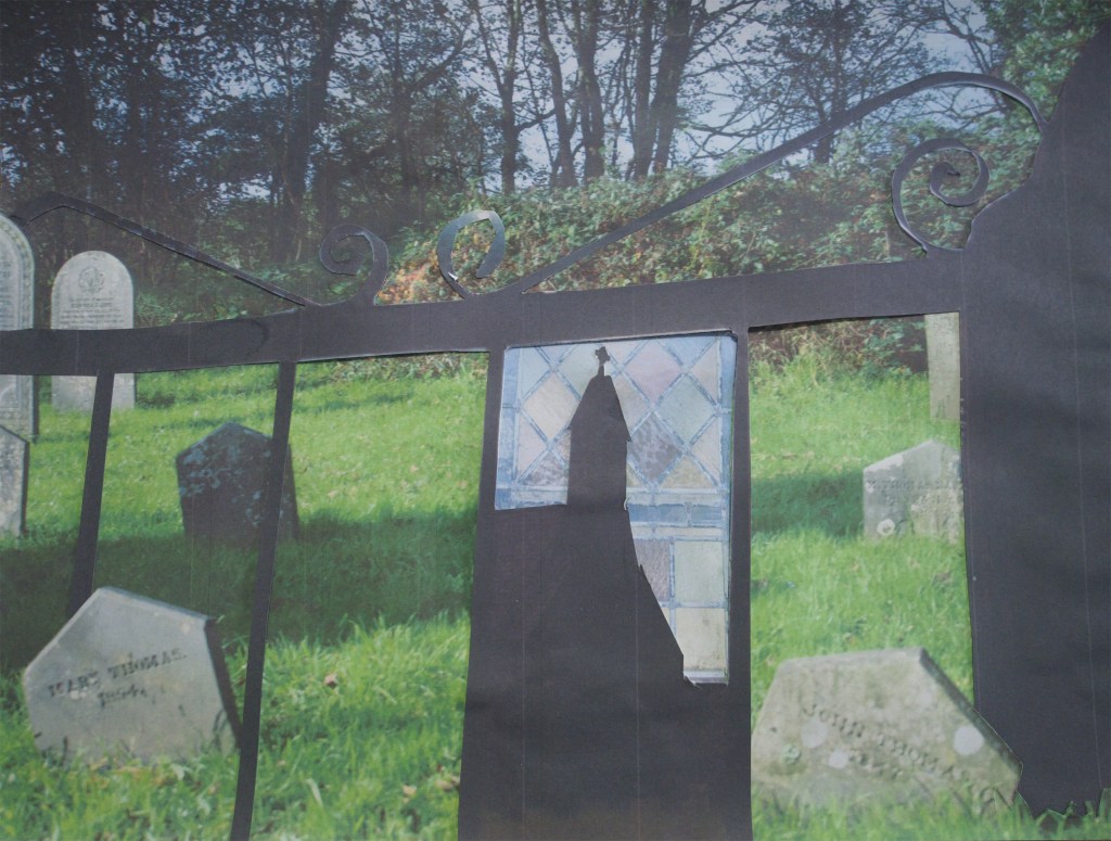
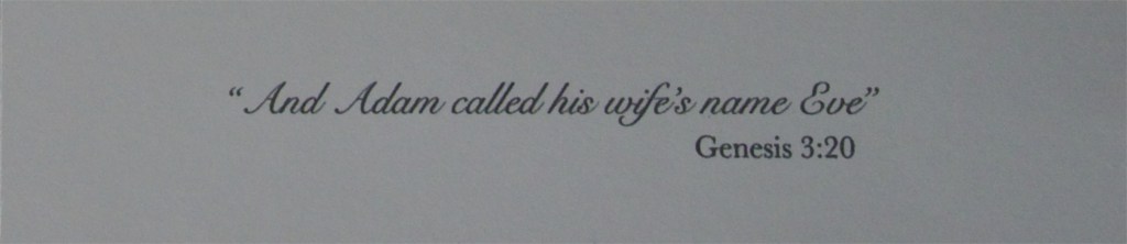
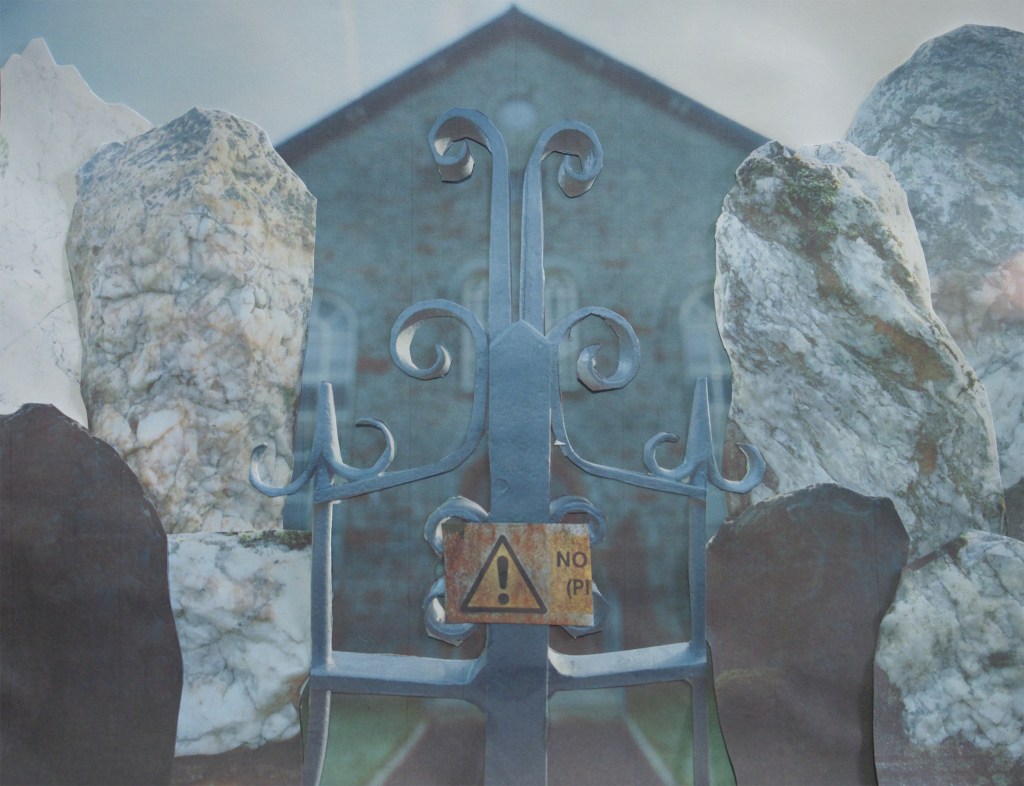
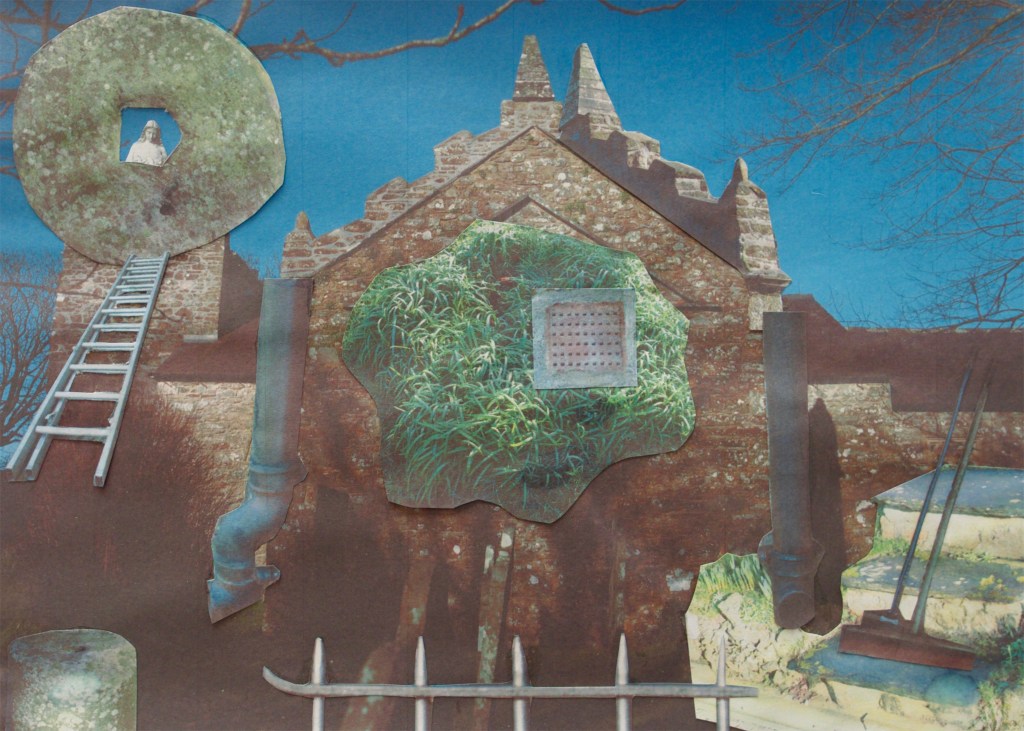
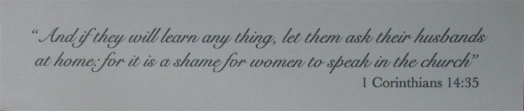
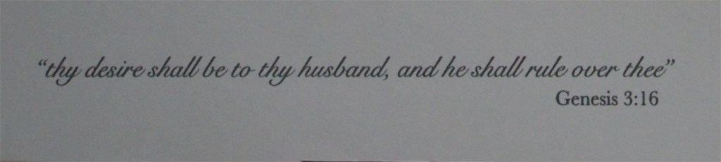
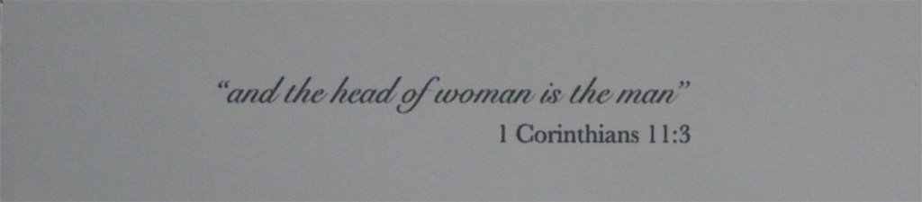
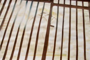
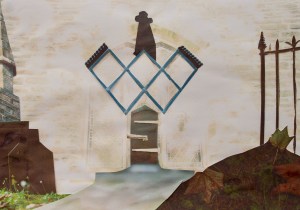
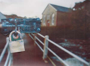
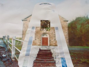
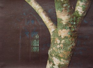
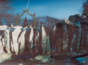
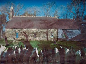
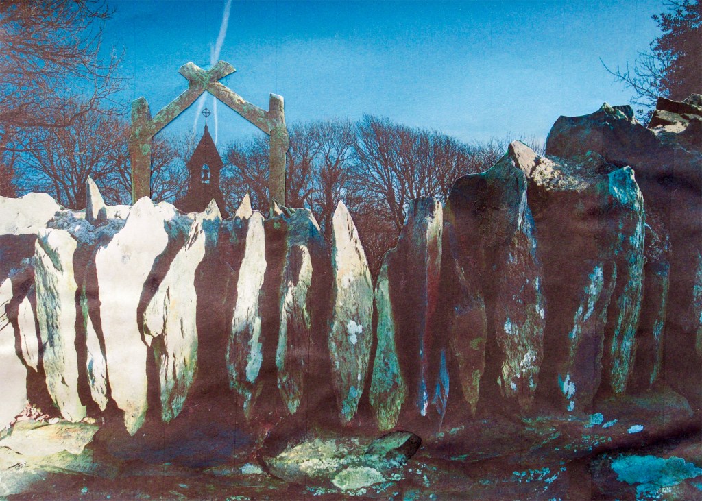
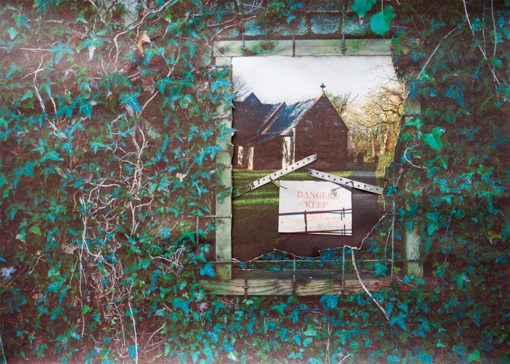
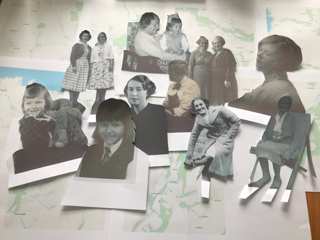
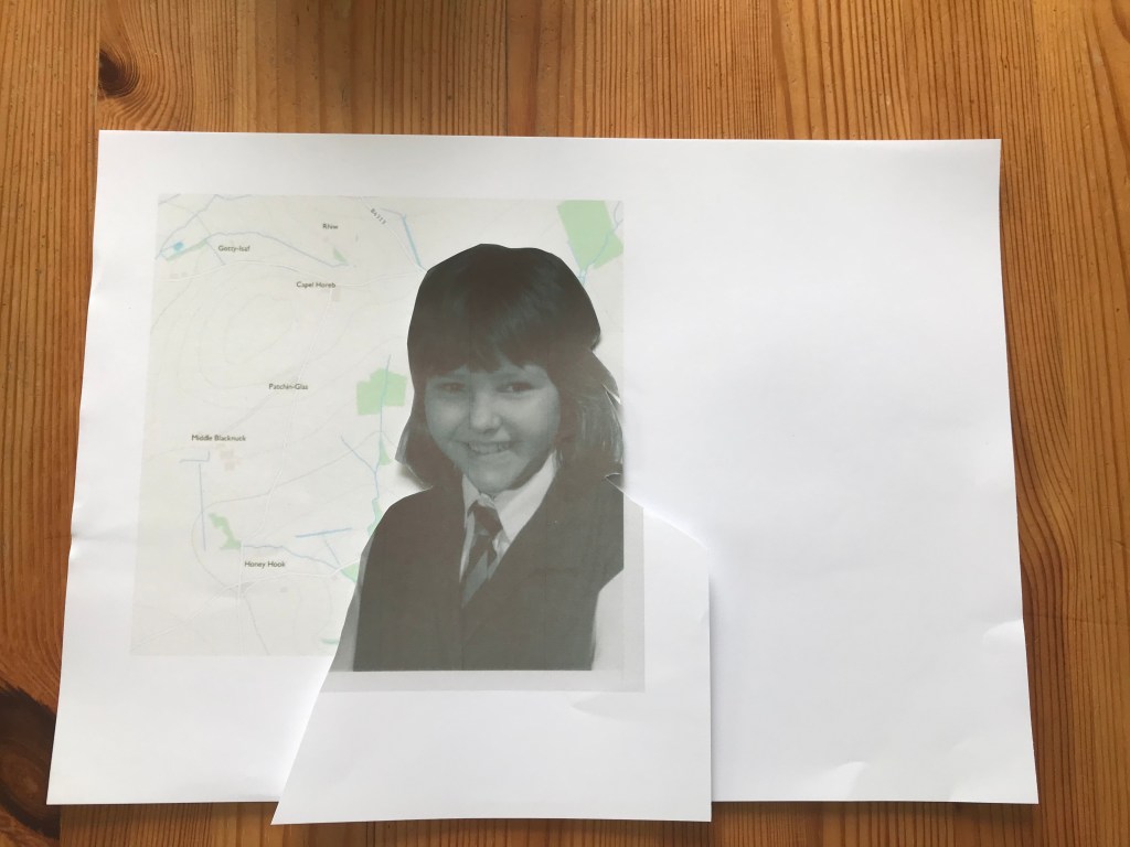
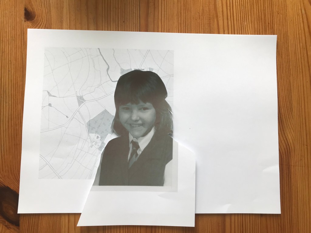
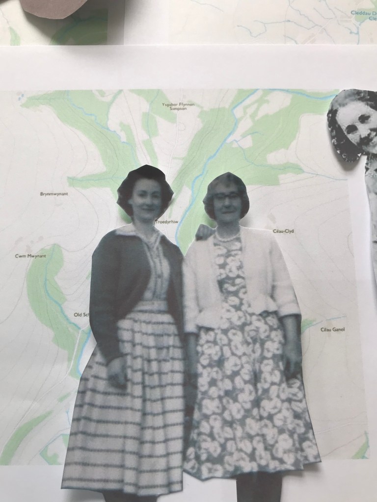
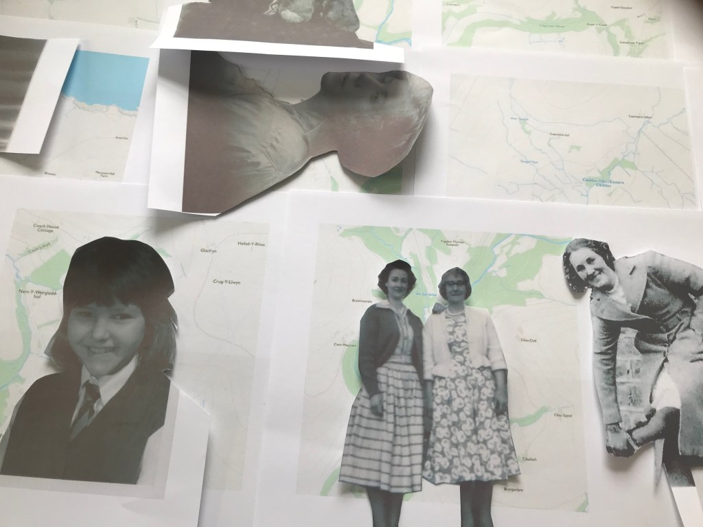
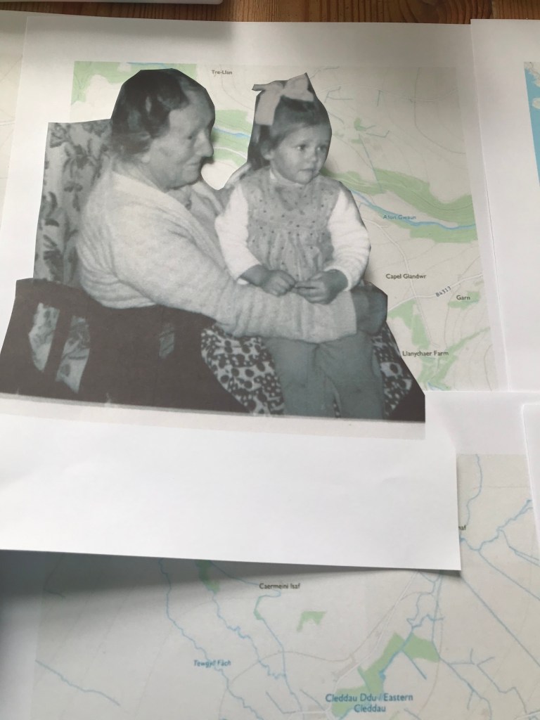
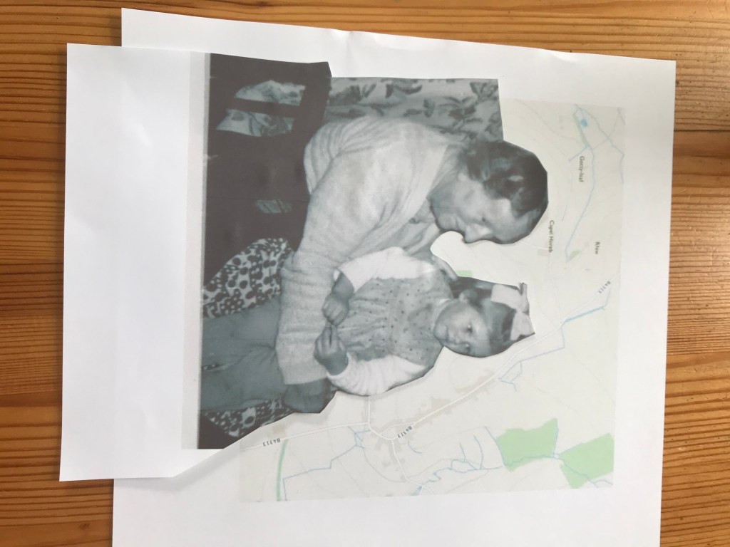
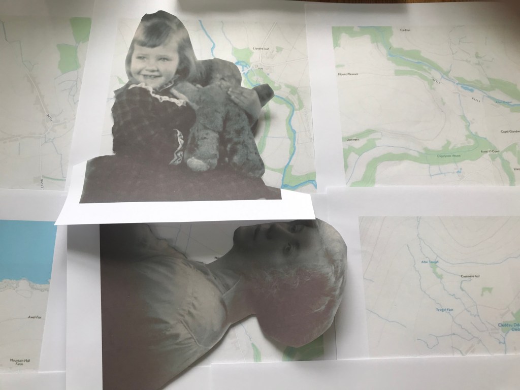
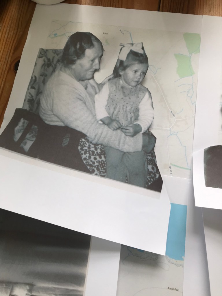
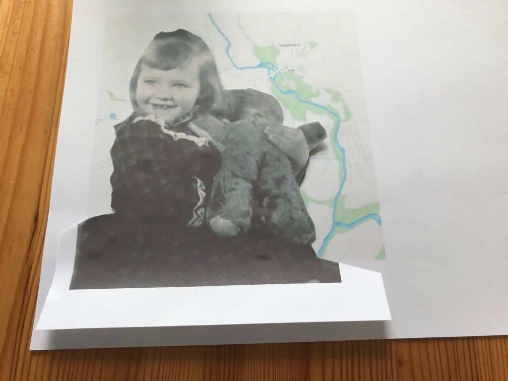
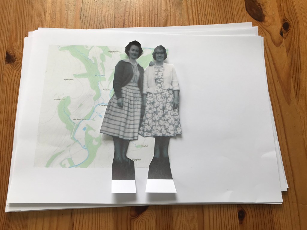
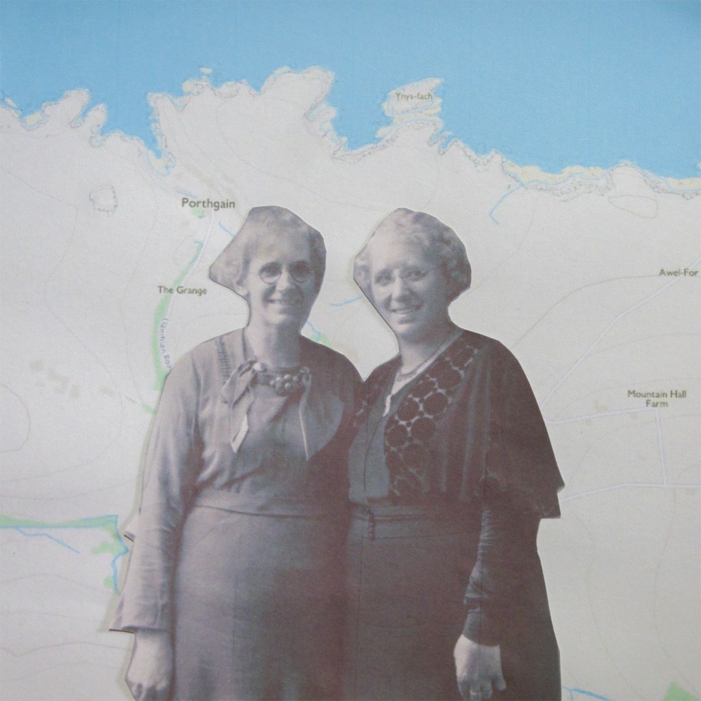
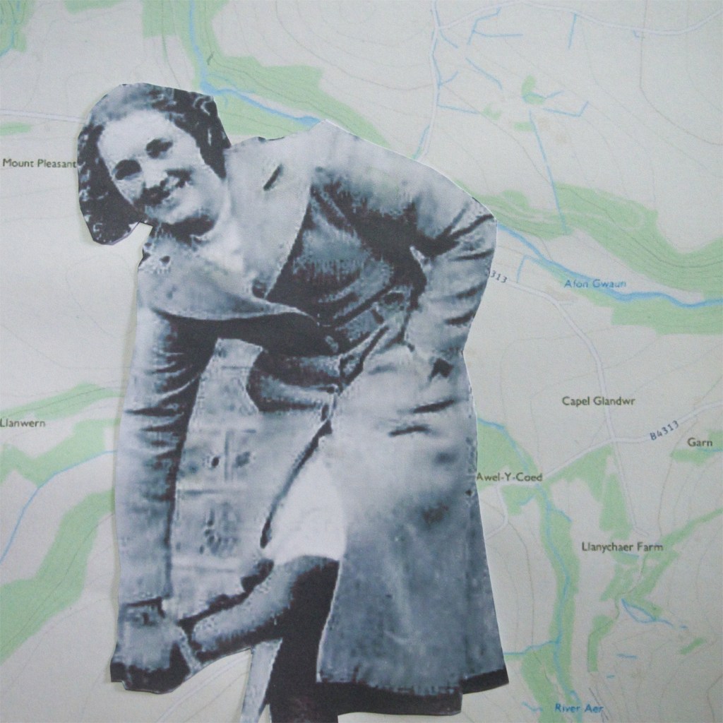
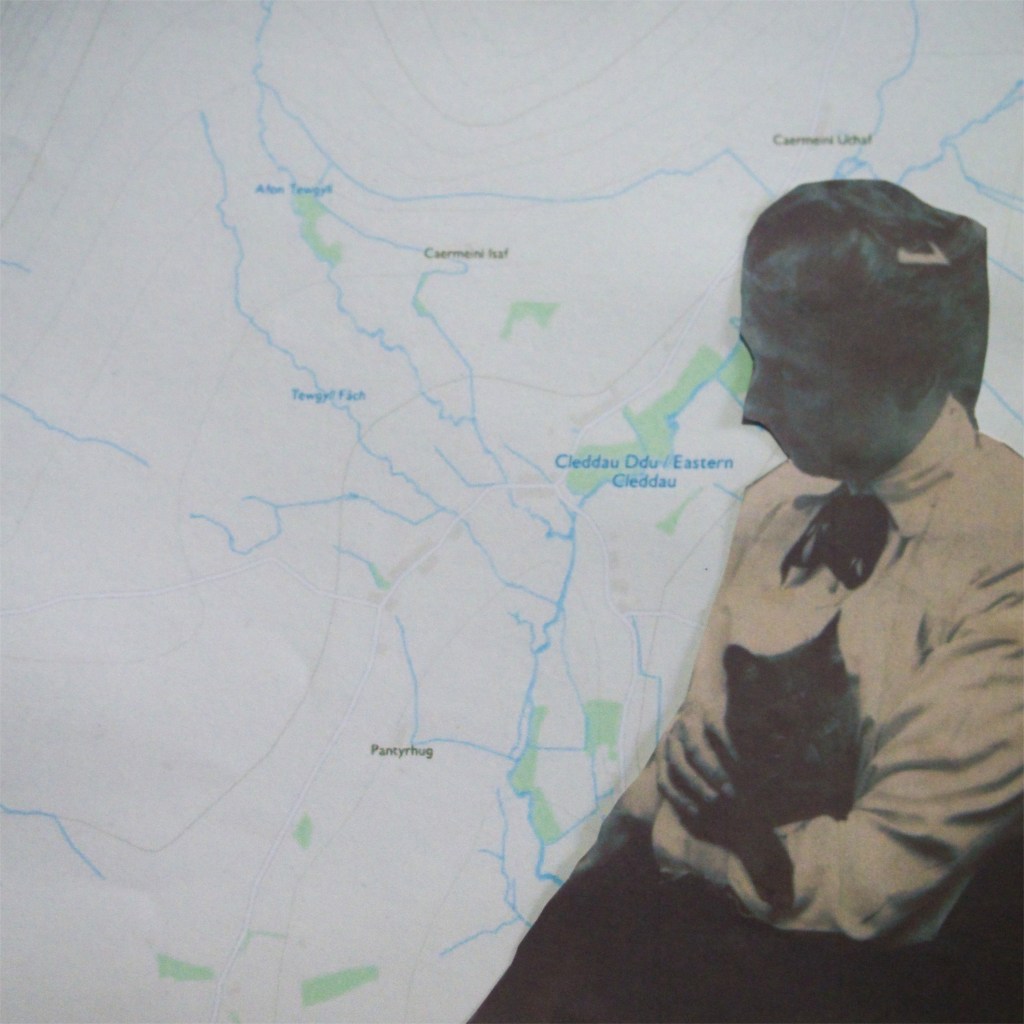
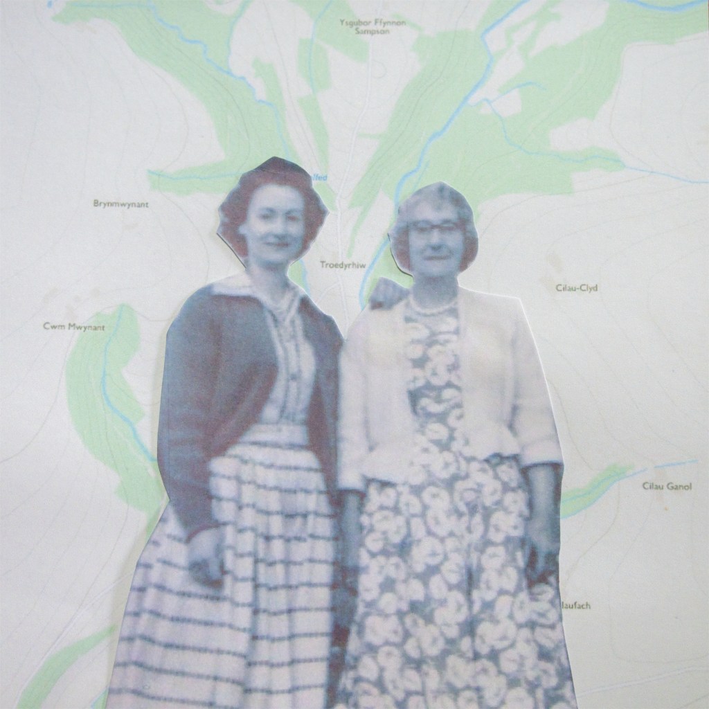
Many landscape images we see are of expansive inviting vistas, rolling hills, glistening waters and vibrant colours. Whilst the images are pretty, there is an issue. Which is that the majority of these are taken by men; through a man’s eye. The gender gap in landscape photography is very prominent, but is quite often looked over. This has led to essentially us seeing the landscape through a male perspective. There are many reasons for this; one specific reason originates with religion. Gender inequality is seen within some religions, this has in time caused ingrained beliefs and created a structured inequality in our society. With my background in studying religion, I decided to investigate the inequality in landscape photography whilst utilising the inequality in religion. I have done this by embarking on a pilgrimage, a route which was specifically designed for men. This allowed me to document this journey as a woman from my perspective and not through a man’s eye. I have contrasted the gender inequality in landscape photography with the inequality in religion, but this also raises the issue of inequality in art and in a global sense too. Using a craft associated with women, my work now takes the form of a collage. I would hope that viewers will be able to see my images and think about gender inequality, their experience of it, and even how they may not have realised the extent. The more we highlight the issue, the more we fight against it, the more improvements can be made. Maybe one day we may all be treated equally.
…your old men shall dream dreams
10th of August 2020
Here is my second draft of my introduction, following my tutor’s feedback:
your young men shall see visions…
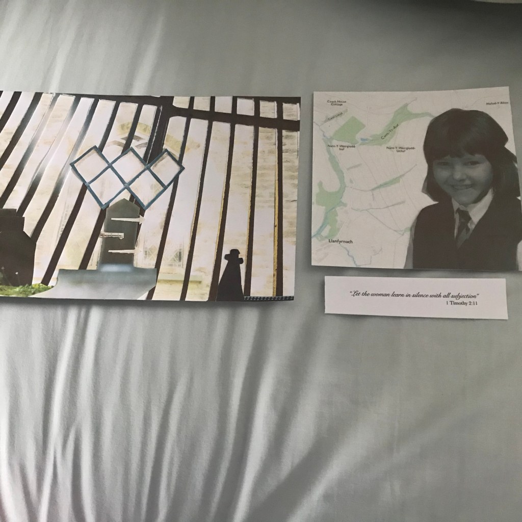
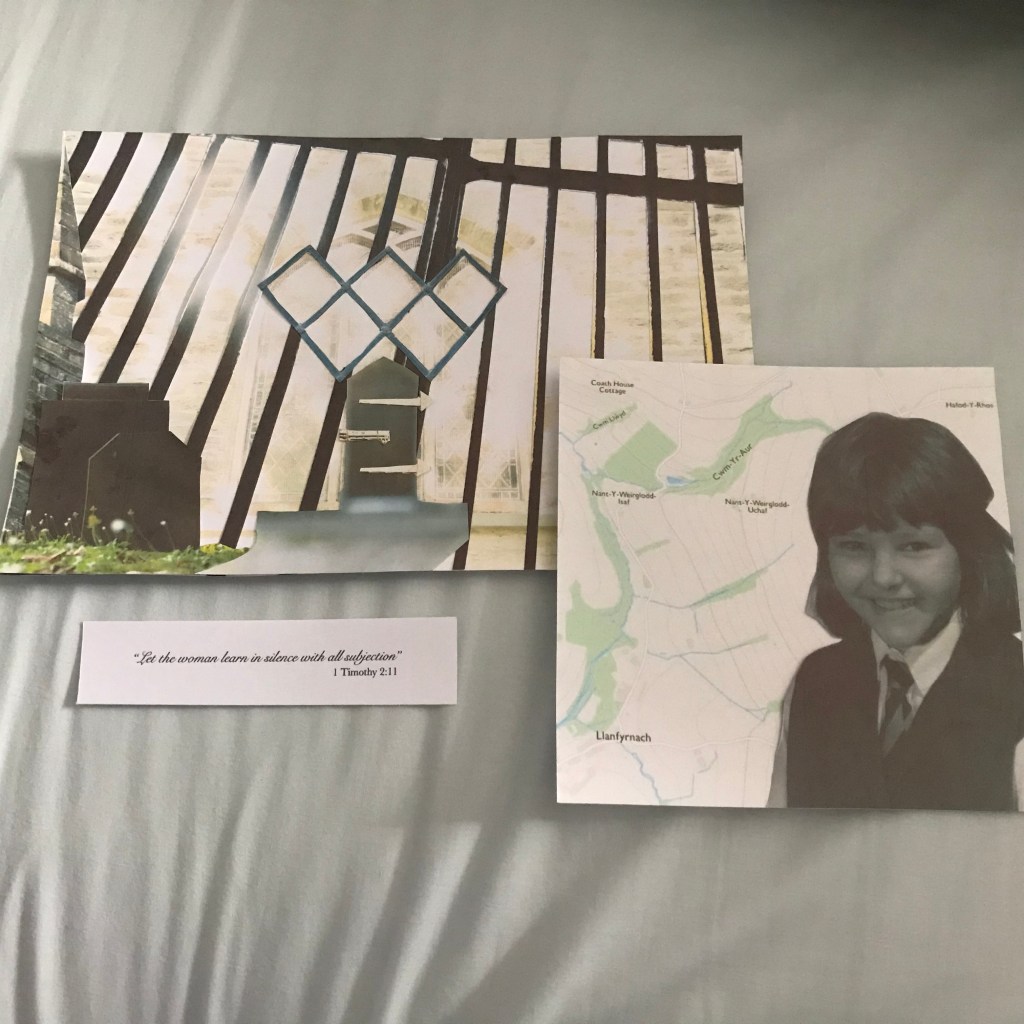
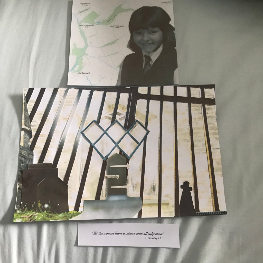
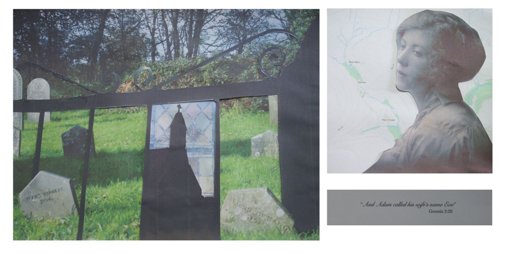
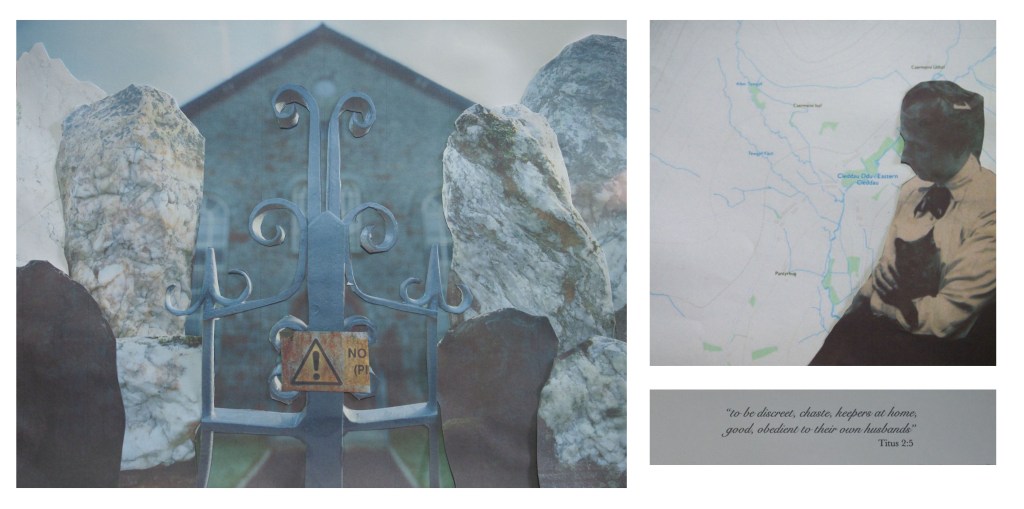
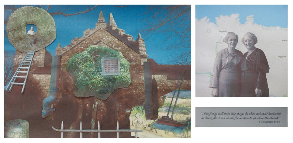
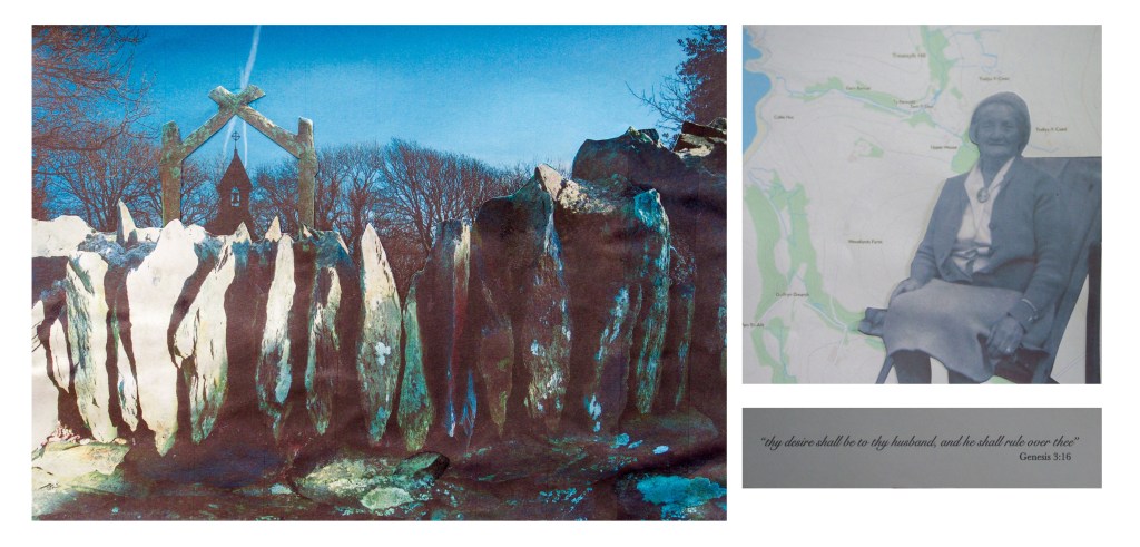
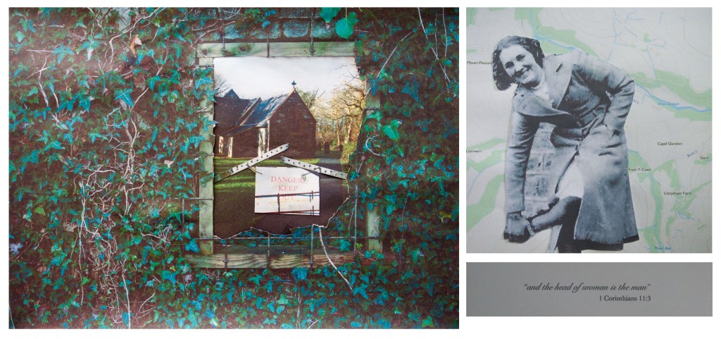
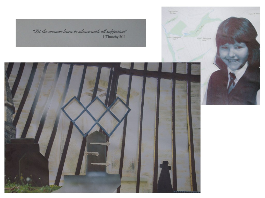
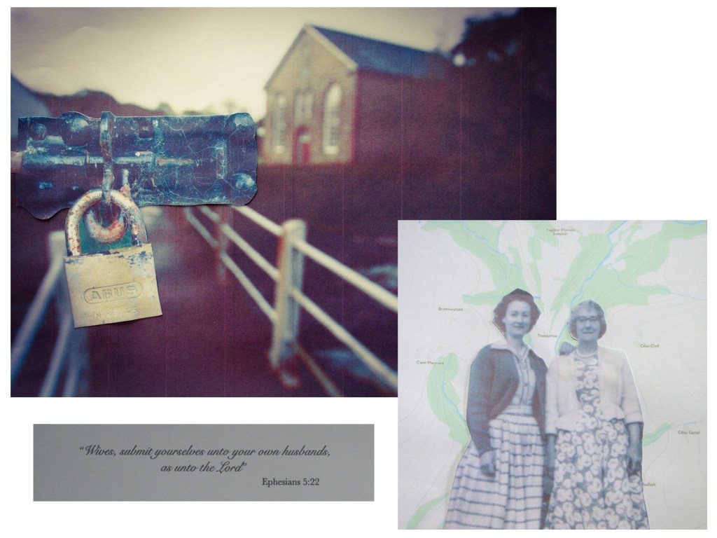
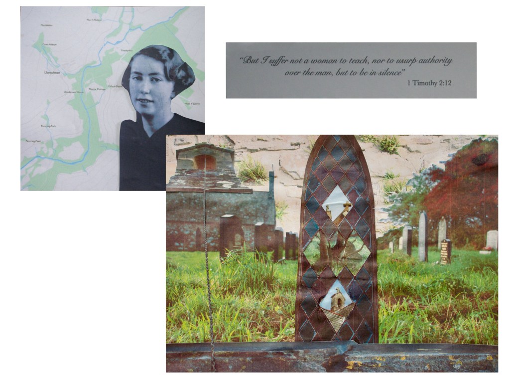
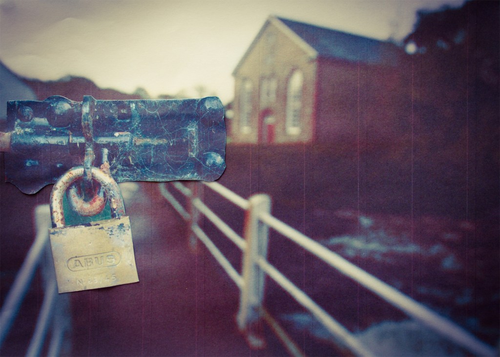
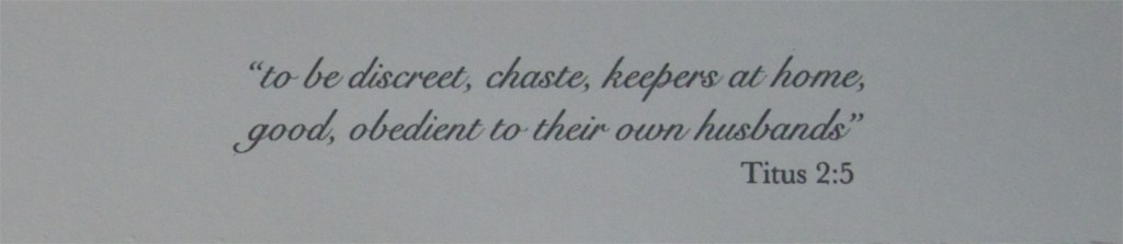
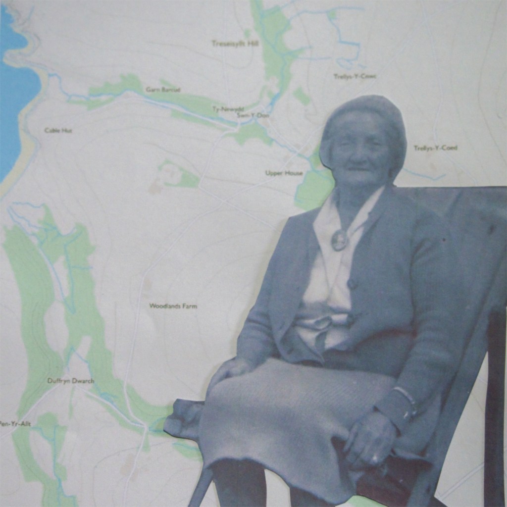
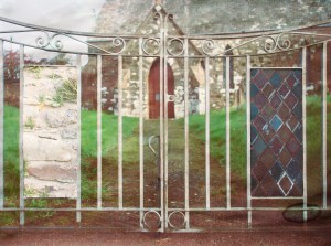
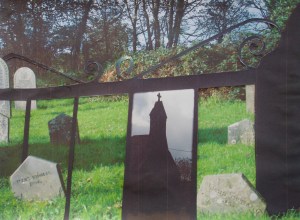
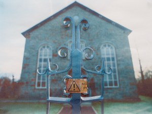
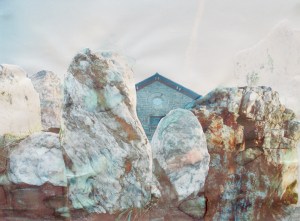
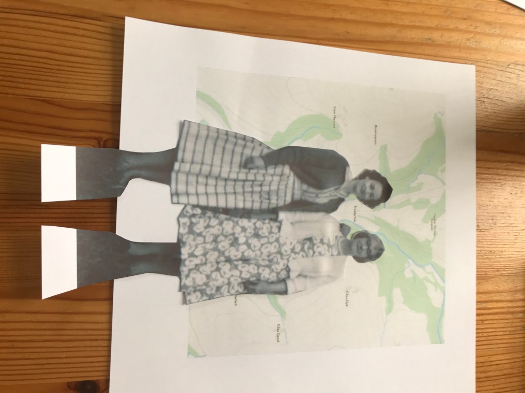
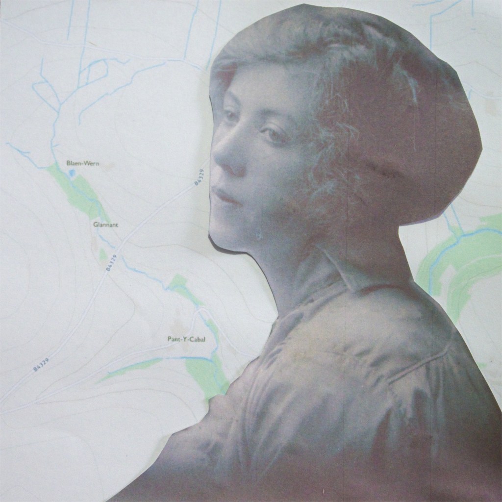
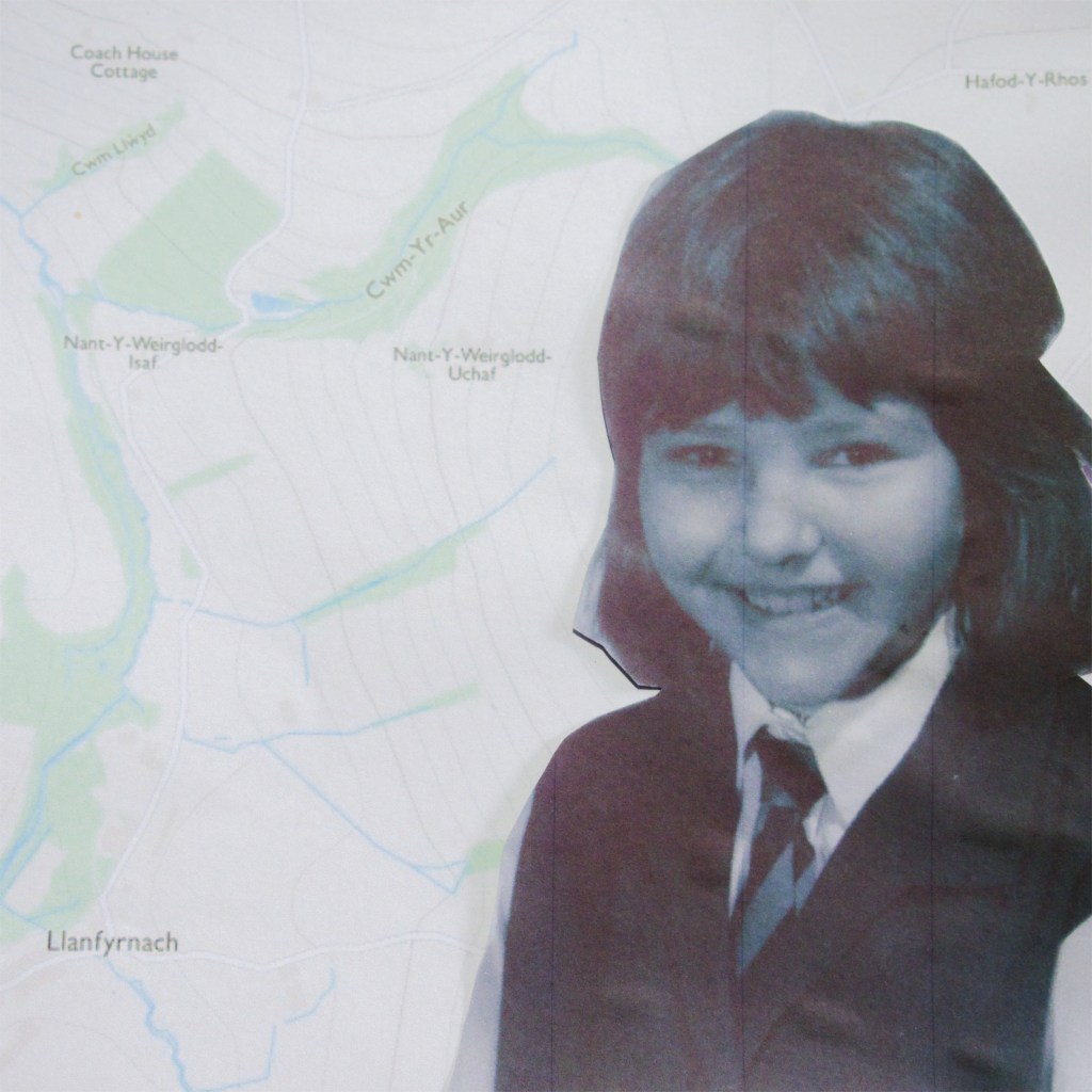
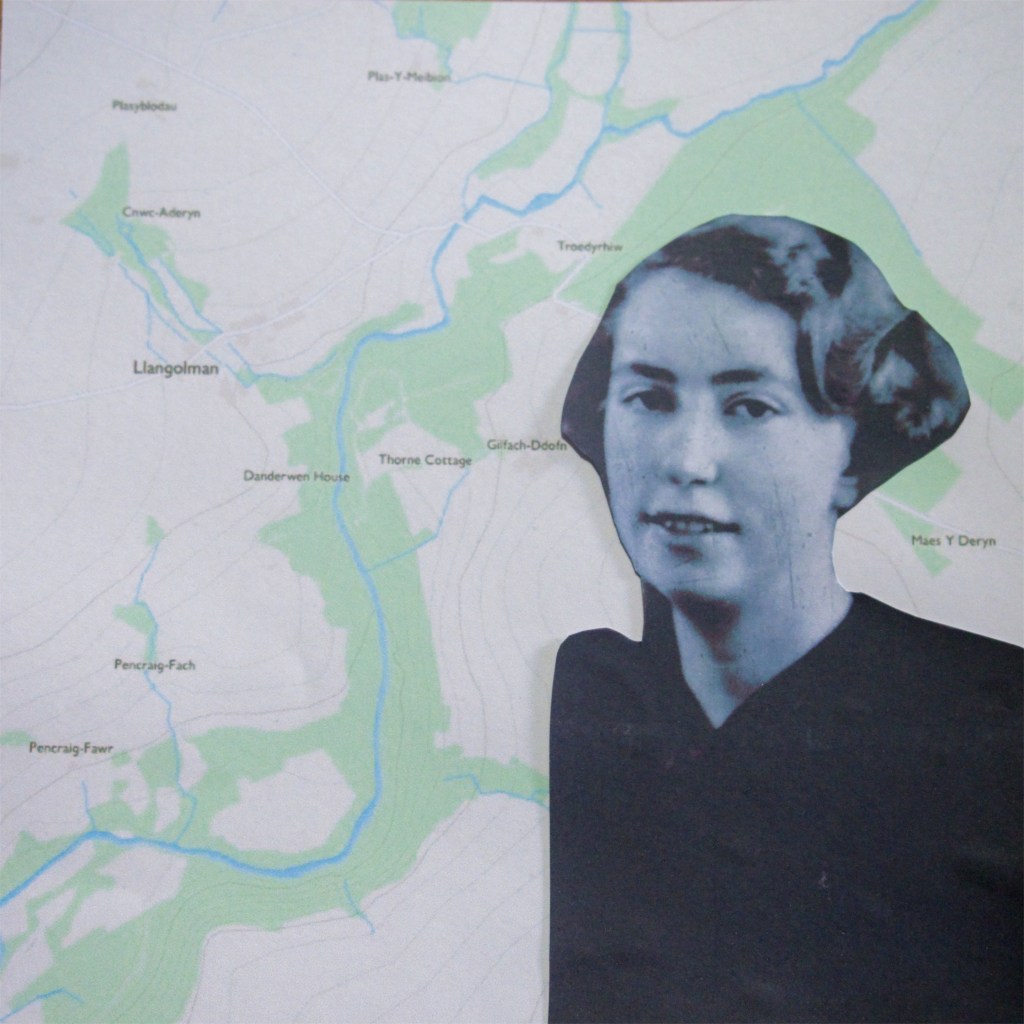
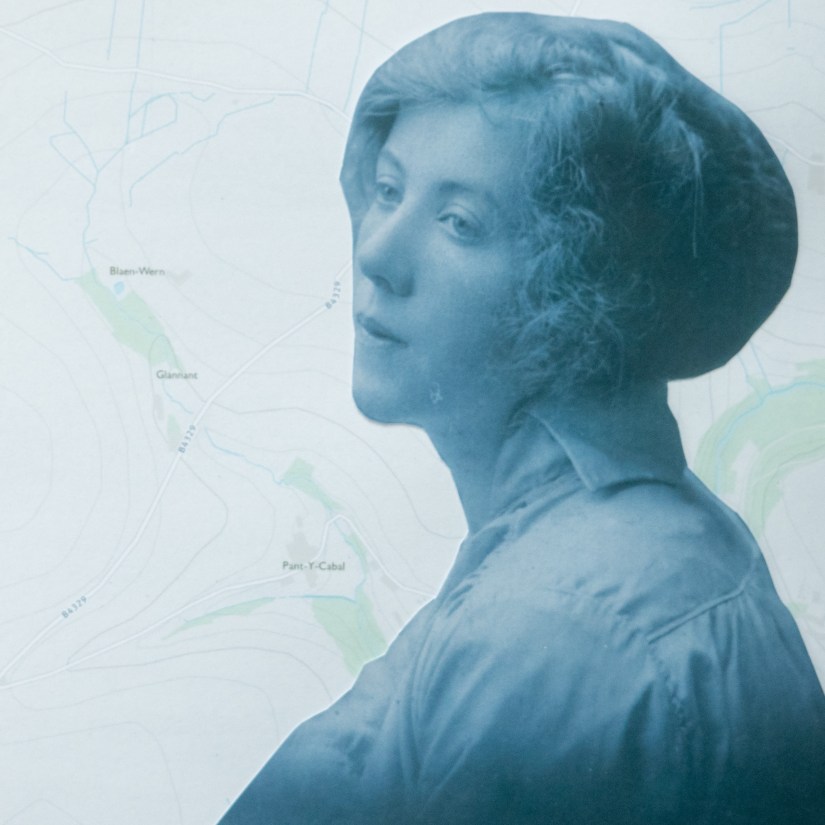
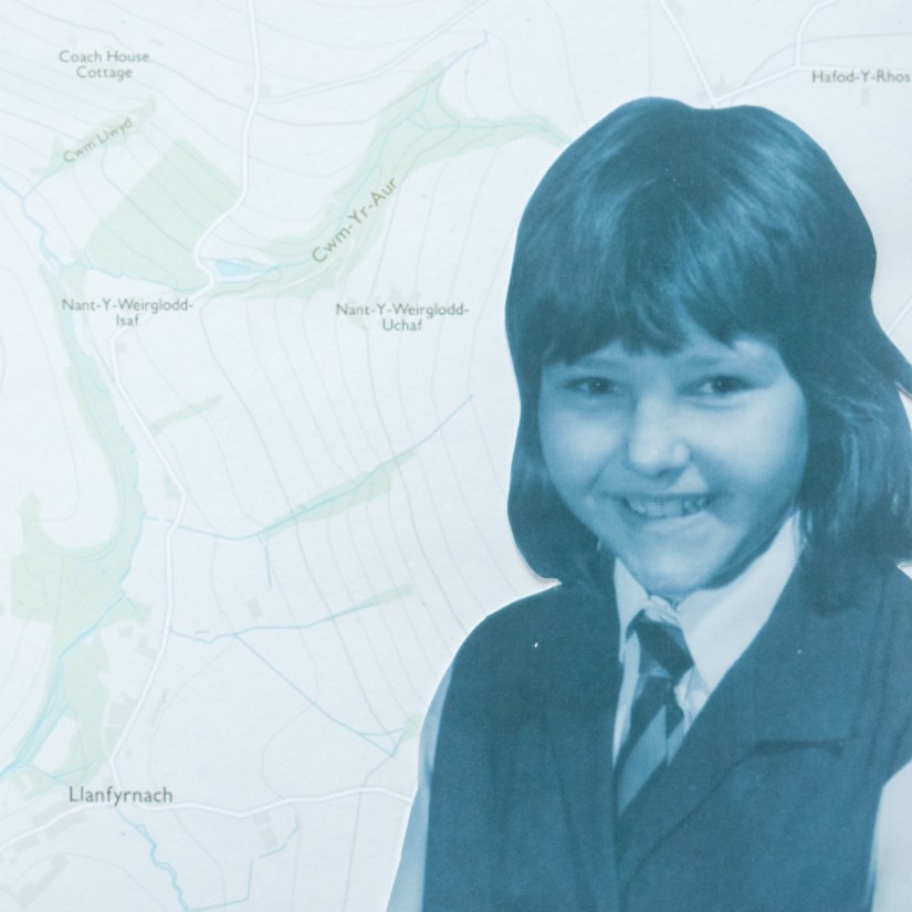
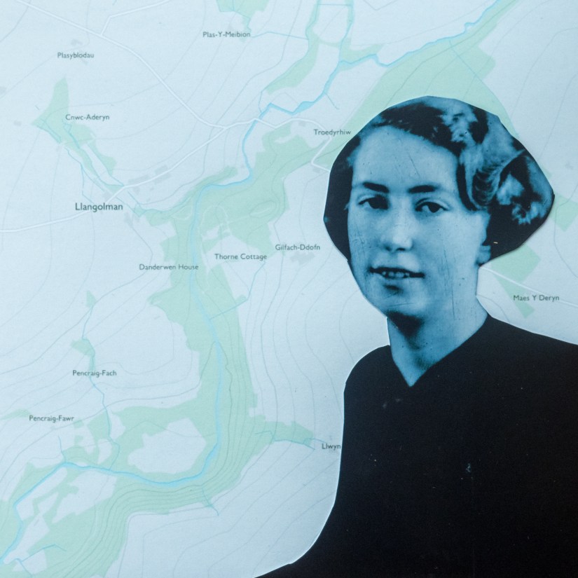
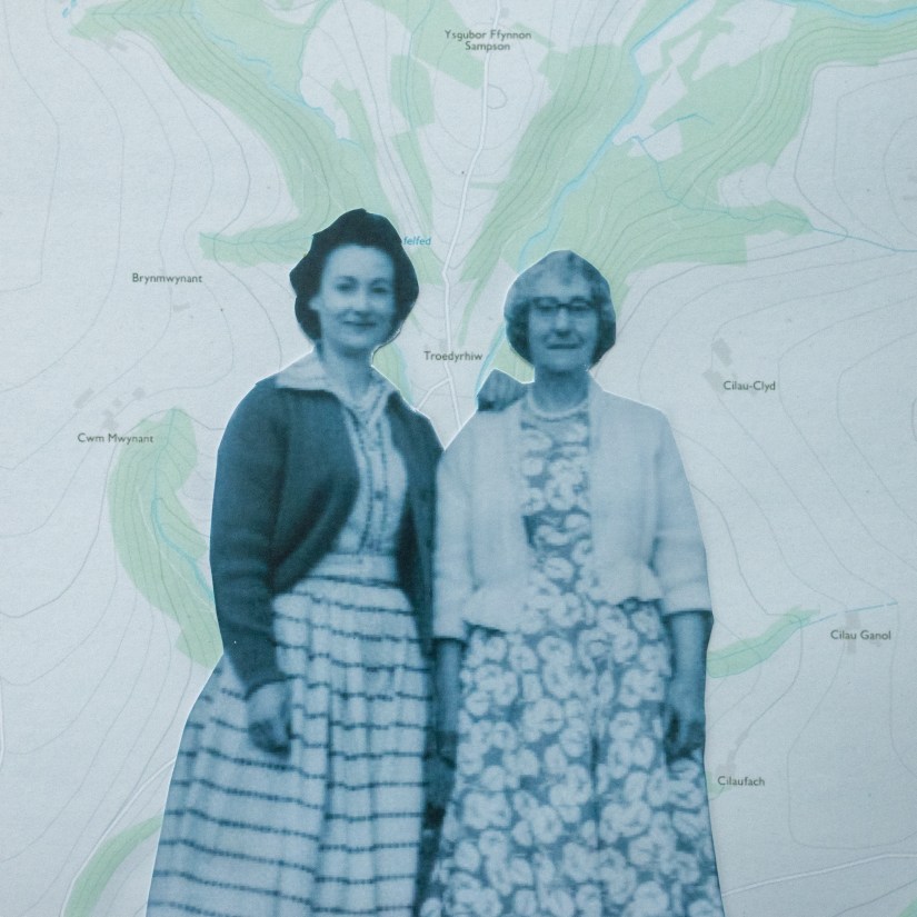
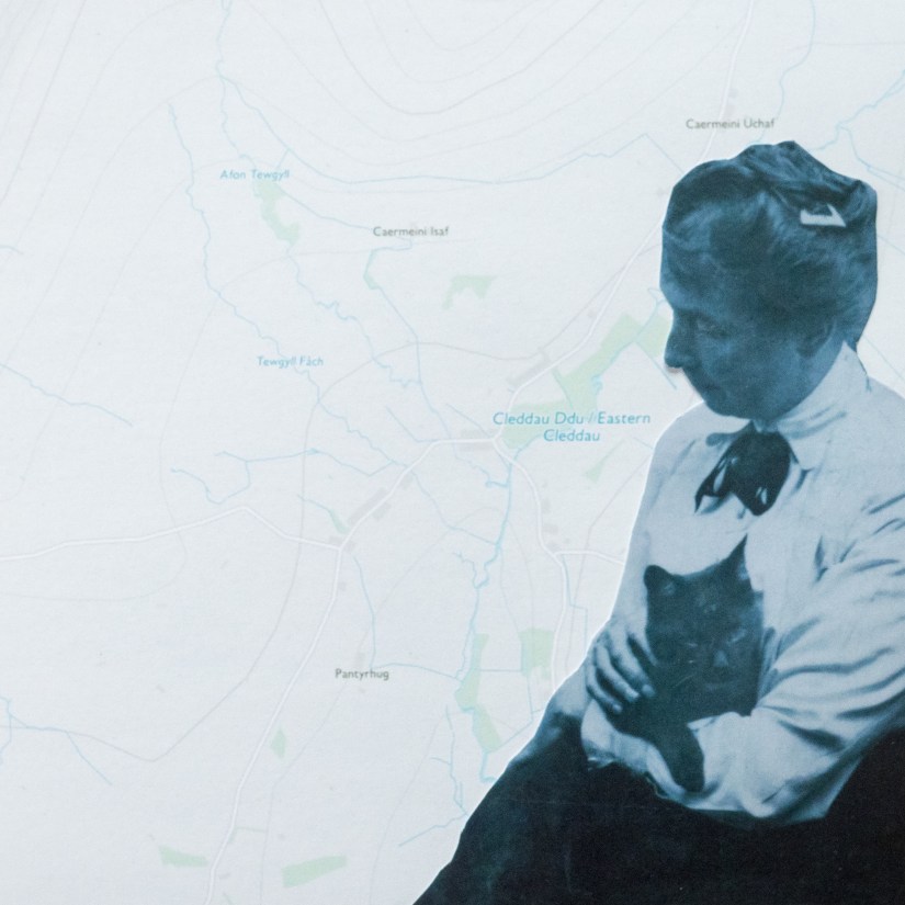
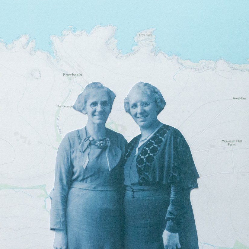
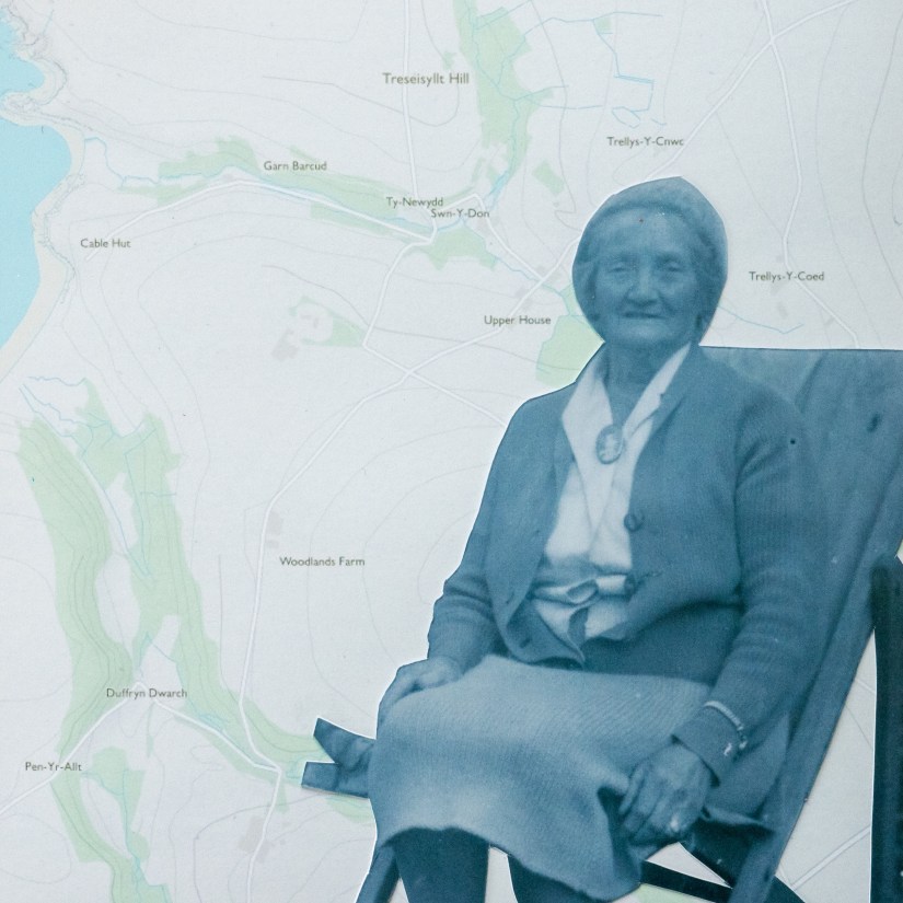
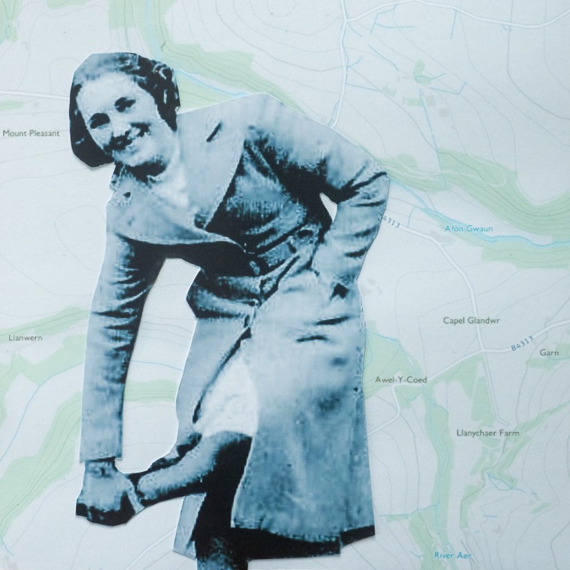
Pilgrimages: a way to get closer to your faith or show devotion? You would think then it would be accessible to all. But this is not the case. My work follows a pilgrimage, one which was specifically designed for men. So what about the women? Well they have been excluded from this journey of faith. Named after the mountainous backbone, In the Shadow of the Preselis, is an aptly named pilgrimage, however with the exclusion of women, one could say, In the Shadow of the Men, is more appropriate. Gender inequality is seen within some religions, this has in time caused ingrained beliefs and created a structured inequality in our society. With my background in studying religion, I decided to investigate the inequality in landscape photography whilst utilising the inequality in religion. I have done this by embarking on a pilgrimage, a route which was specifically designed for men. This allowed me to document this journey as a woman from my perspective and not through a man’s eye. Another area where inequality flourishes is landscape photography. Many landscape images we see are of expansive inviting vistas, rolling hills, glistening waters and vibrant colours. Whilst the images are picturesque, there is an issue. Which is that the majority of these are taken by men; through a man’s eye. The gender gap in landscape photography is very prominent, but is quite often looked over. This has led to essentially us seeing the landscape through a male perspective. My work contrasts the gender inequality in landscape photography with the inequality in religion, but this also raises the issue of inequality in art and in a global sense too. Using a craft frequently associated with women, my work now takes the form of a collage. I would hope that viewers will be able to see my images and think about gender inequality, their experience of it, and even how they may not have realised the extent. The more we highlight the issue, the more we fight against it, the more improvements can be made. Maybe one day we may all be treated equally.
…your old men shall dream dreams