Linder Sterling is a British artist who is known for her feminist collages. She has been influenced from the Manchester Punk scene during the 1970s. This aided in her work and possibly her perspectives. She looks to commodity and gender for inspiration in her art. She uses a tradition methodology of cutting and paste images from magazines and porn. She often uses images from fashion and lifestyle magazine in combination with image of women in porn. Her work is popular, in 2018 she created a 85 metre billboard at Southwark station; she was commissioned by Art on the Underground.
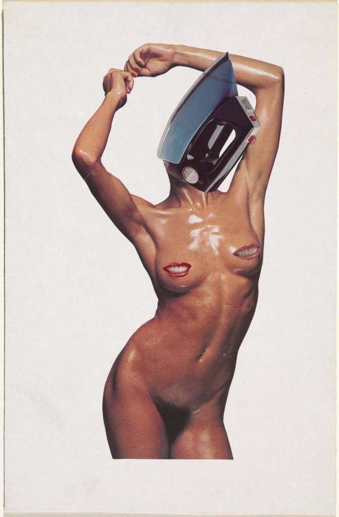
This image (see fig. 1) was used on the music group, the Buzzcocks album cover. This image was created by Sterling. She combined an image of a women naked with an image of an iron. The women is standing in a provocative way, with her arms raised and her hip jutted to the side. Her head has been replaced with an iron. The iron is pointing upwards, in line with where her head should be. Sterling has placed an image of a mouth smiling over the woman’s nipples. There is a noticeable comparison between the shiny plastic and metal of the iron with the woman’s skin which has been oiled. Her image is simple, only being made up of four piece but it is effective and does make the viewer think.
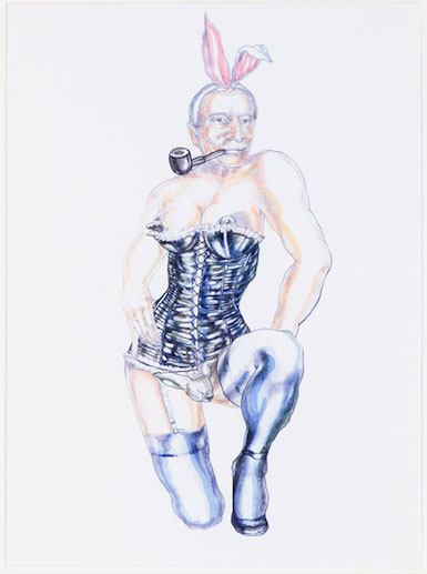
Margaret Harrison is a feminist, and also self-proclaimed ‘radical artist’. Her work address issues surrounding feminism and usually takes on a humorous note. She was one of the founding members of the London Women’s Liberation Art Group. Her work has received recognition from a variety of fronts, including the police. In 1971 the police shut down her exhibition due to her representation of men. This was fatally her first solo show. “It was censored and locked down after the opening for indecency because Margaret feminized the bodies of well-known figures, including Hugh Hefner” (Sanchez quoted in Battaglia). This image that Sanchez talks about is entitled, This is only a bunny but he is quite nice really (see fig. 1). It caused a stir as Harrison had drawn Hugh Hefner as a playboy bunny. It is this type of humorous approach that marks Harrisons work. It is a good take on exactly what Hefner has created. It also allows the viewer to think about issues for women surrounding this.
(Fig. 1. This is only a bunny boy but he Is quite nice really (1971))
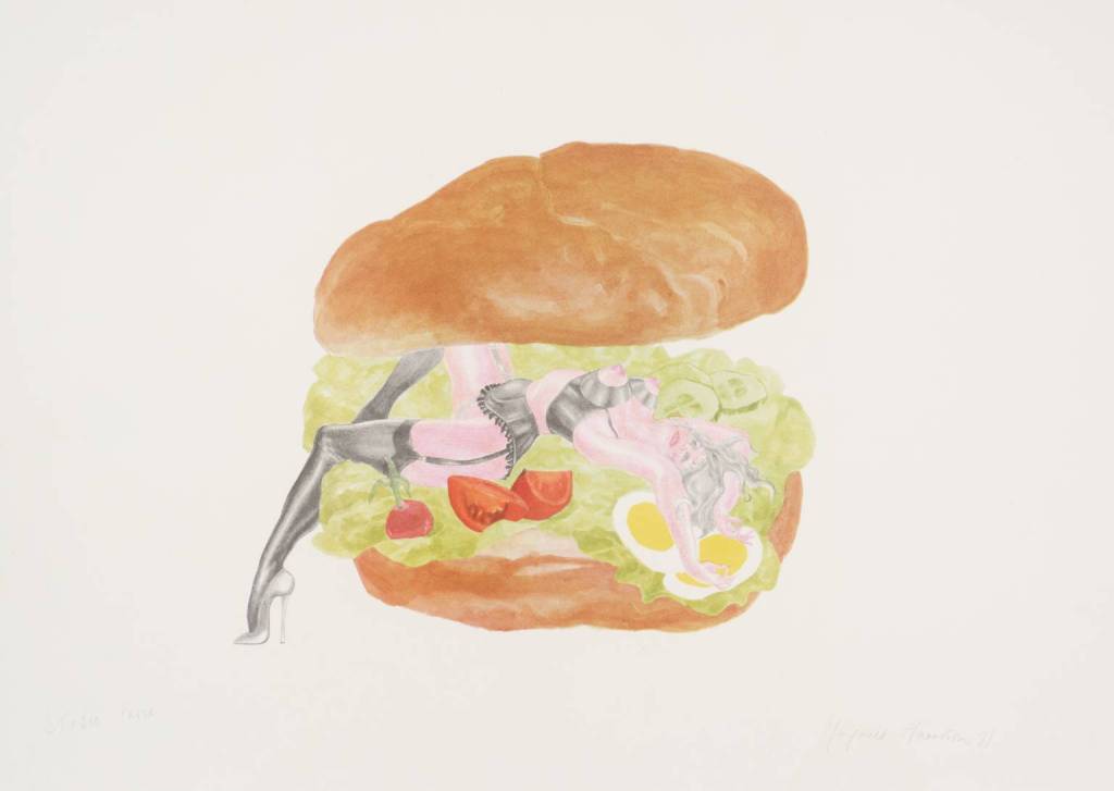
Another image of Harrisons which looks at how women are objectified is called Good Enough to Eat (see fig. 2). The image shows a women laying in a sandwich. It addresses how women are viewed and are objectified. But also how people view women as an object, how an image of women are ‘eaten up’. It is a clever way to highlight this issue. By contrasting the female figure with a sandwich, it shows how easily people devour both as objects and also as something pleasurable.
(Fig. 2. Good Enough to Eat (1971))
I like Harrisons images as they are humorous but raise and tackle important issues. These drawings show a different method of looking at feminism.
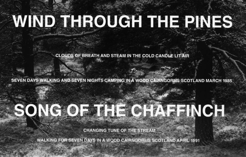
Hamish Fulton is a British artist known for his photographs taken whilst walking. It was after Fulton walked from John O’Groats to Lands End, he decided that he would make “only art resulting from the experience of individual walks” (Fulton quoted in Eyestorm). His work looks at the affinity between art and the landscape. To Fulton, each walk is different and each has an atmosphere that is unique. He photographs his walks, and as such is the one to physically experience it. But the viewer is allow a glimpse at his experience through his images and accompanying text. His methods allow him freedom whilst also addressing issues surrounding the environment. He believes people have become distanced between our natural environment. The use of text is his work is interesting. The text is usually sizeable and placed directly over the landscape images. His image Wind through the Pines is an example of this. The image (see fig. 1) is of a forest scene with the following words layered over the image:
“Wind through the pines
Clouds of breath and steam in the cold candle lit air
Seven days walking and seven nights camping in a wood Cairngorms Scotland March 1985
Song of the Chaffinch
Changing tune of the stream
Walking fo seven days in a wood Cairngorms Scotland April 1991”
(Fig. 1. Wind through the Pines (1985, 1991))
The text and image give off a nostalgic, reminiscent and romantic feeling. The text fills the image but in my opinion doesn’t distract from the image, which is still visible. The text enhances the image.
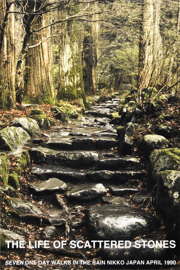
The next image (see fig. 2) is of a stone stair scene in Japan, with the text:
“The life of scattered stones
Seven one day walks in the rain Nikko Japan April 1990”
(Fig. 2. The Life of Scattered Stones (1990))
I like this image. I find it very calming and peaceful even though the stones are scattered around and hit by the weather, they are still there, as strong and solid as ever.
The method Fulton uses is a good example of text in landscape images, which is what my images are. I am going to take notes from his methods, as I like the effect his use of text has, and could help my body of work.
Barbara Kruger is an American conceptual artist, known for her bold graphic images. Kruger was a photographer for two years, but she decided to move towards utilising found images in her work. The images are usually black and white. She gets most of her images form the media, she then edits them and places bold text over the image. The text is usually red and white which creates a striking contrast against the monochrome image. It draws the viewers attention and make us think about the issues she is exploring. The issues Kruger looks at range from feminism, to politics, to consumerism, religion and power. Her images are very recognisable and address these issues with purposely selected images and text.
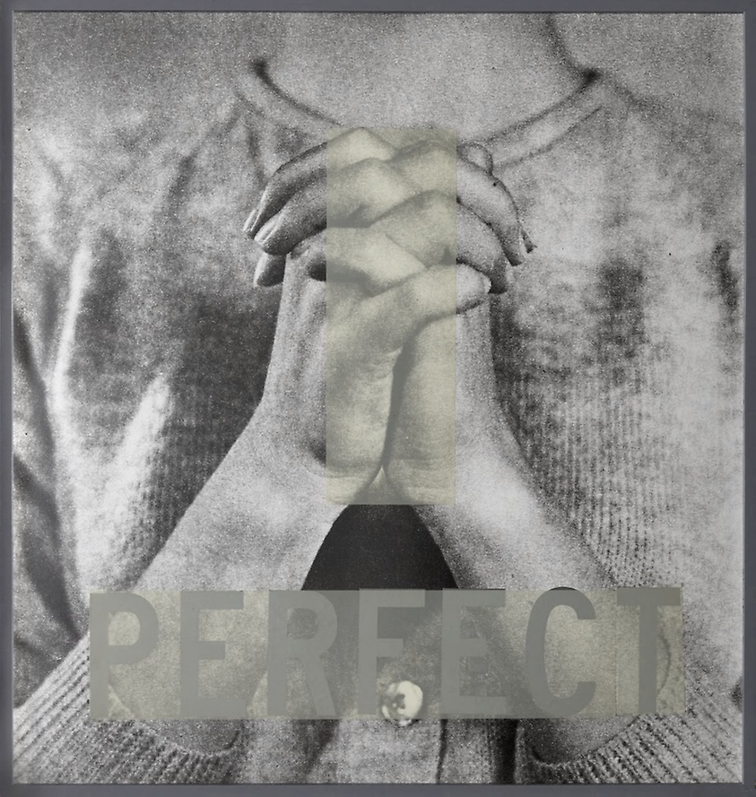
In 1980, Kruger released an untitled image, but due to the text, it is known as ‘Perfect’ (see fig. 1). It shows a woman with her clasped as if praying. We only see her torso, she is a plain jumper of cardigan. The woman gives the impression of innocence, faith and obedience. Kruger calls on the idea of the virgin Mary. The image represents in sense the perfect women, a dutiful passive embodiment of femininity.
(Fig. 1. Perfect (1980))
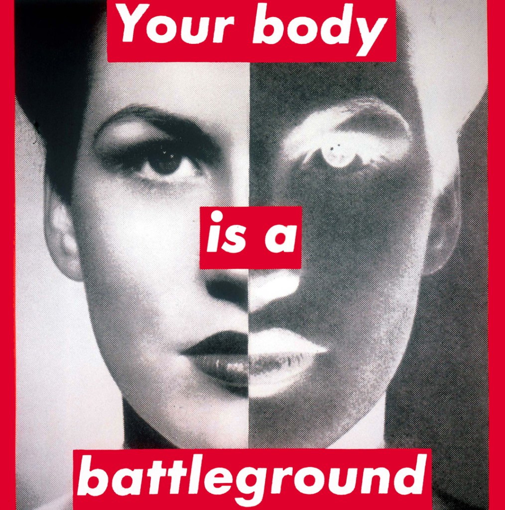
Another image Kruger produced, is probably one of her most notable pieces. The untitled work (see fig. 2), ‘Your Body is a Battleground’ brings to light the anti-abortion laws. The images was made specially for the Woman’s March on Washington in 1989. Kruger showed her support for the freedom of choice for women. The image features a portrait of a woman, which is spilt vertical, half in positive and half in negative. This is a powerful image, which has remained relevant throughout the years. To me it can be seen as much more than support for reproductive choices, it can refer to other areas where women are restricted, judged and oppressed.
(Fig. 2. Your Body is a Battleground (1989))
Krugers use of text is bold. It stands out, almost overtakes the image and alludes to the deeper meanings. The use of red and white text creates a striking contrast to the black and white image. Her wordings are often very simple but do echo a issue or problem. Her images are very successful and I will be taking note when looking at using text in my body of work.
I decided to do some research into collages and how it can fit with my body of work. The first thing I found was historically, collage was seen as a pursuit for women. The was because it was a craft often done at home, it was seen in the same league as mosaic, quilting and needlepoint. This could be a good fit with my body of work as I am looking at highlighting the inequality in the art so by using a method associated with women would contrast the inequality. Collage became popular in surrealist art, as it was “a form of inspired correction, a displacement of the banal by the fertile intervention of chance or coincidence” (Agari quoted in Thorpe). It was during the 1970s when artists were addressing issues surrounding race, gay rights and feminism, that collage began to take a central role in art. Many feminist artists used this due to its roots as a female pursuit. The bringing to light of these issues needed a new method of portrayal in order to highlight and fight them, many artists turned to collages, as by cutting and rearranging the images it creates new images, new perception, and new identities. Collages have the ability to pull apart and restructure an image, it offers a new view on a subject. They are used to challenged the order and expectations that have become ingrained in our societies. To Penny Slinger, “collage is not just a technique, it represents an approach to reality” (Slinger quoted in Thorpe). Many feminist artists using this technique look at the female body and how they are seen or perceived. They also contrast the view of women against men, women are often forgotten whereas men are ‘heroes’. In an interview, Zhanna Kadyrova stated that “the discrepancies between images of men and women struck me for every three images of women, there were a hundred images of men. I then noticed how their roles are depicted. Men are shown shaking hands, women are shown in adverts, in the cultural sphere, or with a baby and that’s all’ (Kadyrova quoted in Svitlytska). Collages has the ability to re-shape an image and form a new narrative. It’s historically perception as a female pursuit makes it a perfect platform for my work. It has been interesting looking into the history and how other artists have approached this method, it has been inspirational and has helped me form a few ideas.
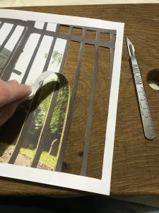
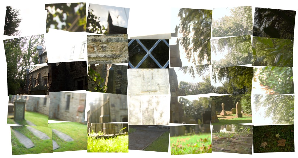
Following my recent conversation with my tutor, it was suggested that I spend some time trying some collage work. I decided to keep it simple initially to try it out. I choose one location to concentrate on and spent time looking at the images. I did some research into collage work and then narrowed down my images. I tried several approaches, the first being quite simple. I have had to take a photograph to show my experiments, as they won’t fir in the scanner very well. If I do use collage for my body of work. I will either send the actual collage in or re-photograph it.
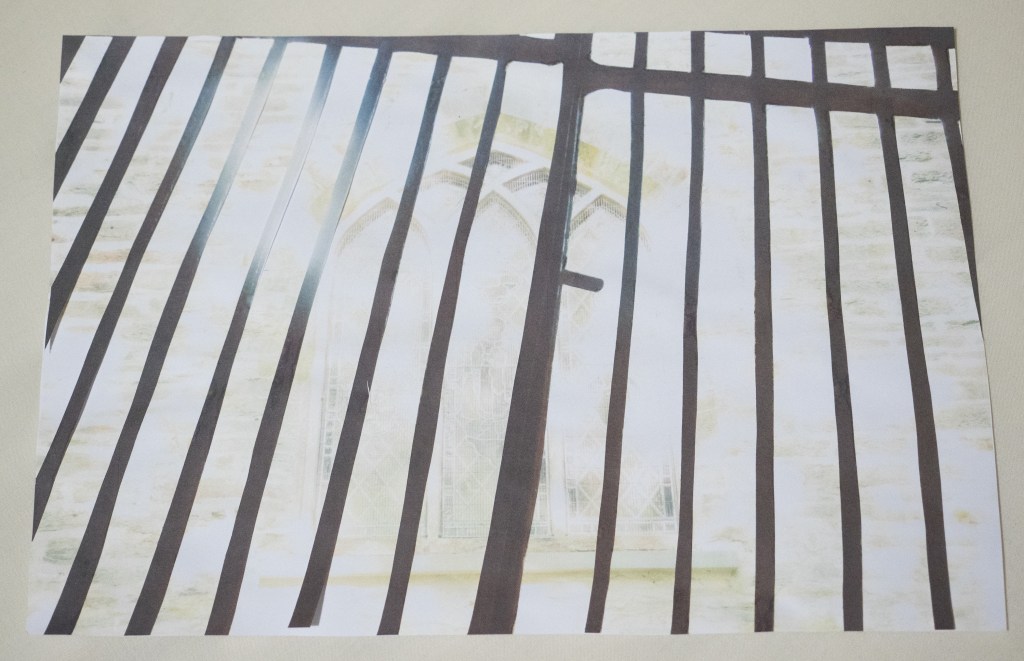
I started by cutting the bars out here and then glued the bars on top of the main image.
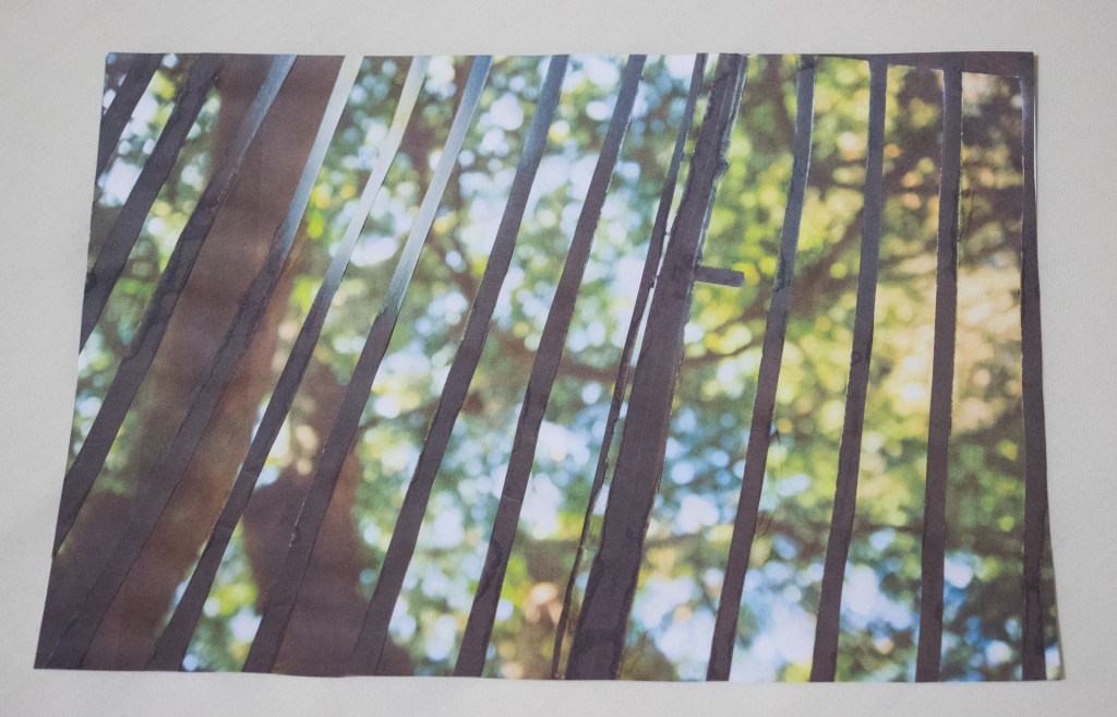
I tried two different background images. It is simple yet represents how women are excluded and not allowed behind these ‘bars’.
Here is the first:
Here is the second:
I like the first image as it is quite simple but I believe the bars portray how women are barred or excluded. But also the wall shows how solid and impenetrable this is, there is also no doors in the image, hinting how women are seeing things from the outside and not allowed in.
I decided to add images of the leaves and trees for extra dimension, to me they also add another element of showing the inequality and oppression but also bring a feminine aspect to it. I could probably reduce the size of these, so they fit better:
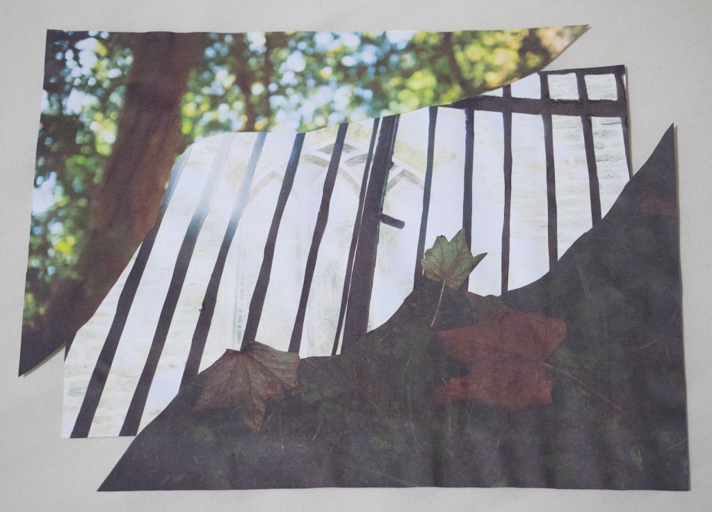
I took another approach which involved cutting out specific parts of the images to make a completely new image. I used a similar approach to Hannah Hoch. I choose my main image as the background and then printed out others in various sizes to work with.
I started by cutting the images out:
I arranged them and kept moving them around until I was happy, I then glued them down:
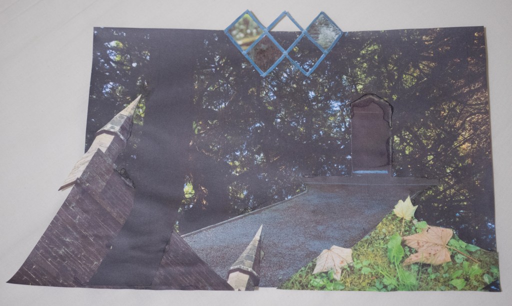
Here is the finished image:
I like the path leading up to the door which is ‘locked’. The base image of the wall, shows also how impenetrable it is. I tried to keep the leaves and trees are outside the bars; as to me the foliage and flowers are a feminine aspect and as such aren’t ‘allowed’ behind the bars or behind the walls, to represent their exclusion. The images of the leaves and the branches to me feel almost dark and oppressive.
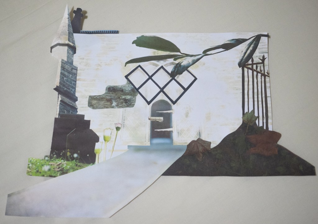
I created the next image using the leftover cutouts, but I feel it can hold its own. It features a path with a door that you can’t get through, symbolising the exclusion. But it could also represent the journey or pilgrimage that this is. This image also reminds me to be more careful with the glue, as you can see on the door how I got it on the picture side. Here is it:
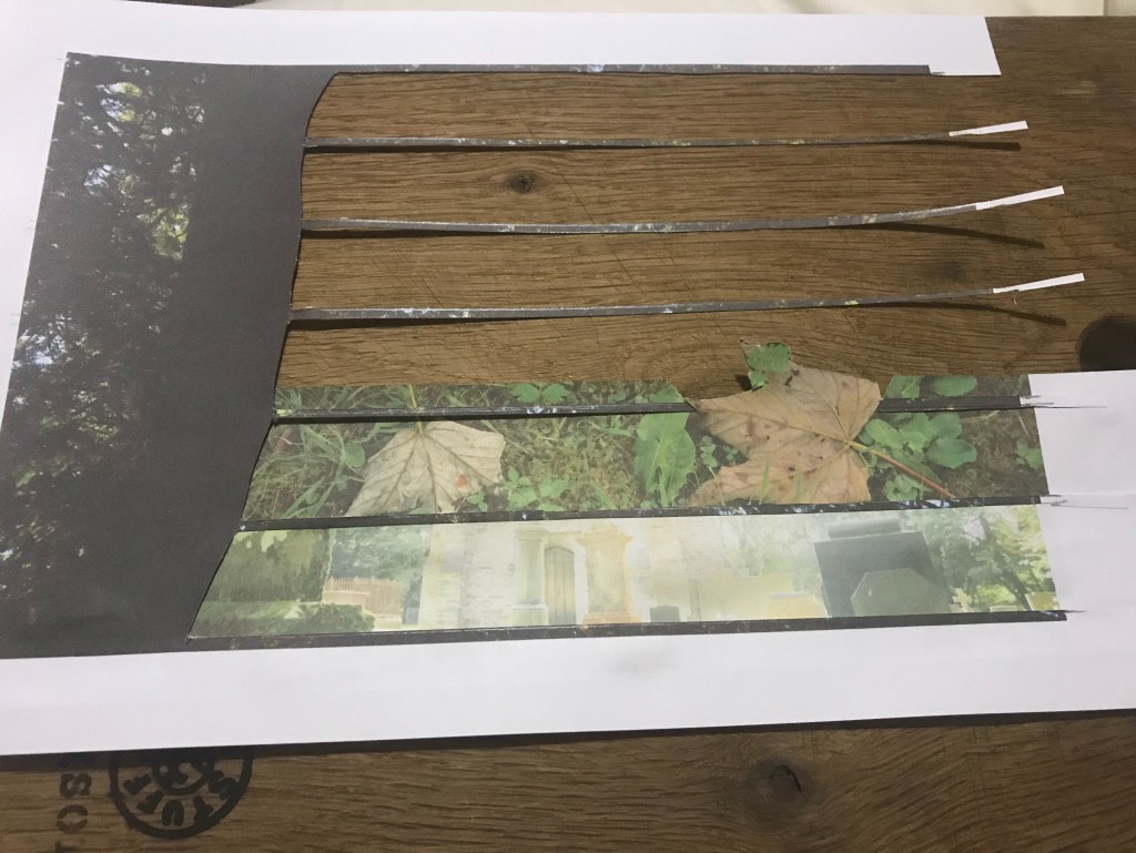
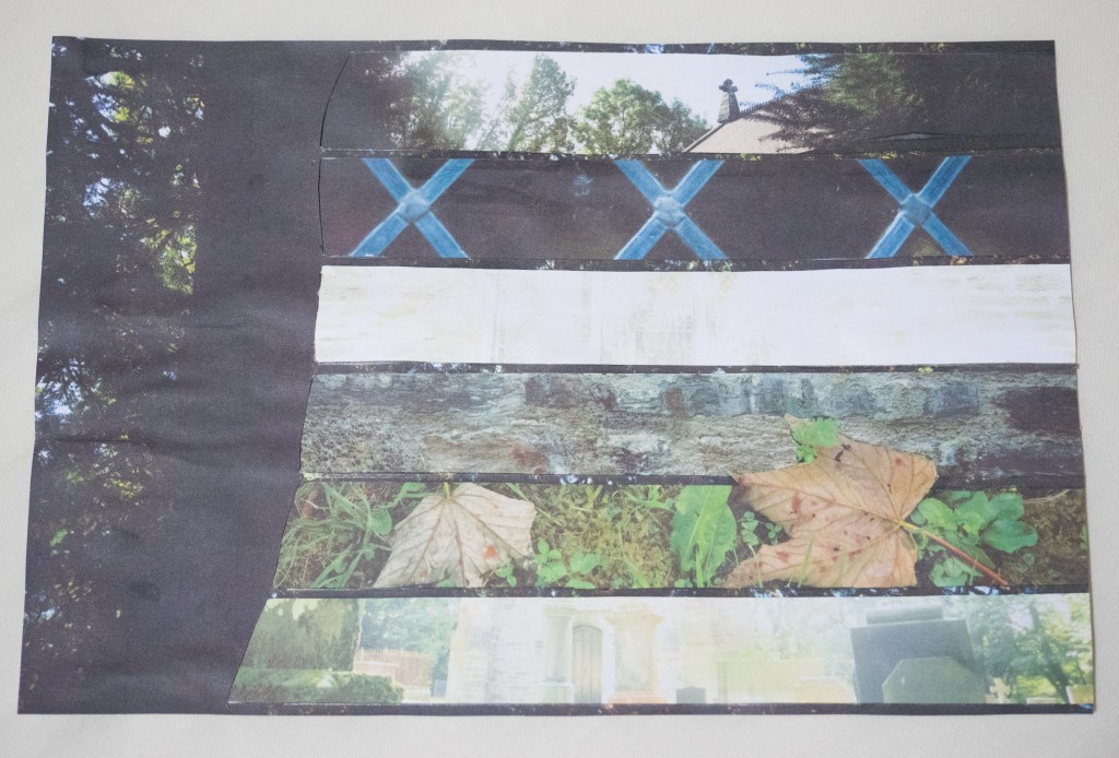
The next image was the last one I made. The idea for It came suddenly and i just went with it. I actually really like the result. The had the main image of the trees, which I then cut horizontal segments and choose images to show through. I like how you get snippets through the lines; this way it still contains important aspects. Aesthetically I like the design. I did think how I could incorporate somehow showing the locations through maps maybe. With this image one of the segments could be a snippet of a map. Here is the image:
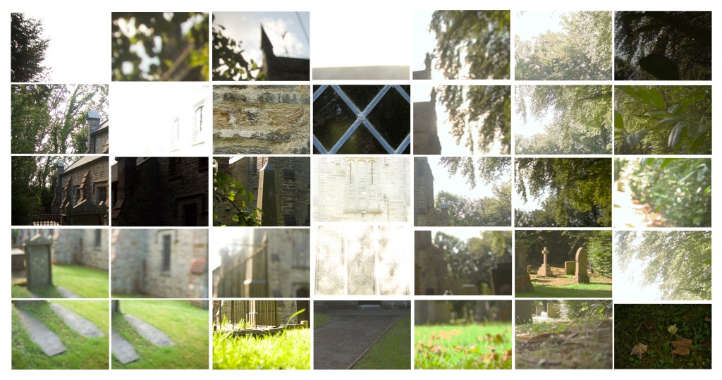
I also tried a digital montage, I drew inspiration from David Hockney. I tried arranging the images so they were wonky and overlapping and also with them straight and in line with each other. I decided to replace a few images to bring in various images. Here are what I came up with.
I like the result of the digital montage. Personally I prefer the one with the images arrange straight and in-line. I just feel it is easier to look at and make out. I am not 100% sure on replacing a few images, I am not sure if it looks right, perhaps keeping it with the correct images would be better. This image I choose was quite complex, a simpler one would probably have been more effective.
Here is a simpler image, with it arranged wonky and straight:
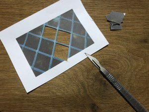
I like the simplicity of the image with just the bars, as it does show a deeper meaning but so does the detailed collage image. I liked making this image, it was quite fun moving things around and I found it quite therapeutic. I really did enjoy this process and think it would be appropriate for my work. But I also found the digital collage fun and interesting to view. I do think a simpler image is better. I can visit my locations and do re-shoots if necessary. I also need to be careful assembling the image as the glue can get on the actual picture and ruin it. Another thing which I hope will improve with practise is the actual cutting the images out. The images aren’t the problem, the knife is. They are very sharp, which I found out the hard way!
I have been thinking also how to move forward. Once I decided on a collage format, I will try and keep this consistency throughout my series. As my work is in the psychogeography genre, I was thinking of incorporating the places locations in somehow. This could be in the form of text, for example the handwritten coordinates. Another idea would be to use maps, this could form the background base image on which the final collages sit. It could also provided a link between the images as you can follow and see the journey unfold. I was also thinking about the foliage and flowers representing a female aspect. Instead of cutting out the images and putting the in the collage, I could include the actual leaves and flowers from the actual sites. This would bring the female aspect but also creates a strong link to the sites, the images would be quite unique, as the flora and fauna would vary. I could position them on top of the collage and then re-photograph or scan it. These are just a few ideas about moving forward, somethings to explore.
Kara Walker is a collage artist who investigates issues surrounding gender, sexuality and race. She is known for her silhouettes on a white background. Her techniques reminds me of shadow puppets in a way. This could be seen as womens’ art, which also draws attention to the gender issues.
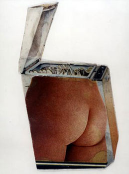
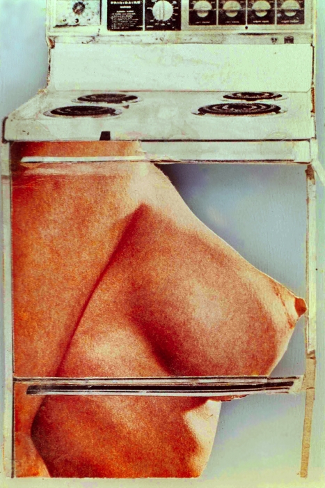
Martha Rosler is another artist who I have come across in my research. Her work takes many forms including performance, video, text, instillations and photomontages. The majority of her work in made from the perspective of a woman. Her feminist art looks to challenge the representation and expectations of women. In her works entitled Cold Meat I, Cold Meat II, Damp Meat (see fig. 1) and Hot Meat (see fig. 2).
(Fig. 1. Damp Meat)
(Fig. 2. Hot Meat)
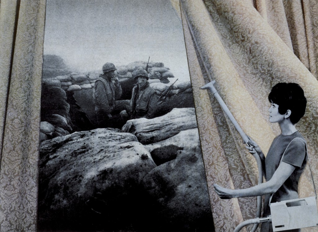
Rosler combines images of naked women with domestic appliances. These works show how the female body is commodified, she compares it to food. “I was always interested in addressing people, primarily women but not only women, with the idea that you recognise me for other human beings” (Rosler Quoted in Murg). She uses images of women in magazines from the 1960s and the 1970s. She believes the tradition views of women still have a startling hold on women today. One image that stuck out was Cleaning the Drapes (see fig. 3), it shows a women vacuuming the curtains, whilst the spilt reveals a scene of soldiers. This contrasts the domestic view of women with the way the media showed people images of the Vietnam war, these images came to people through televisions which were relatively new.
Paula do Prado uses various techniques and materials including painting, textiles and photography. She addresses several issues in her work including identity, stereotypes, and race. Her work contains references to her culture as well as her experience of living in Australia. She is originally from Uruguay and often combines her heritage and language with her art. Her works often contains Spanish phases and sayings, this is an advantage in her art as “this tension between exclusion and inclusion is important” (Prado quoted in Madeleine). “Art provides a vehicle for me to explore, scrutinise, decipher and tease out these interconnections between culture, race and identity…dealing with some of these issues is hard…I’m not an activist by any means…It”s more about seeing things differently” (Prado quoted in Madeleine). Her work on gender is helpful for my work, I am looking at gender, and much of her work does too, she sees gender “like race, as another category that is socially constructed, that I don’t think anyone truly fits into neatly” (Prado Quoted in Madeleine).
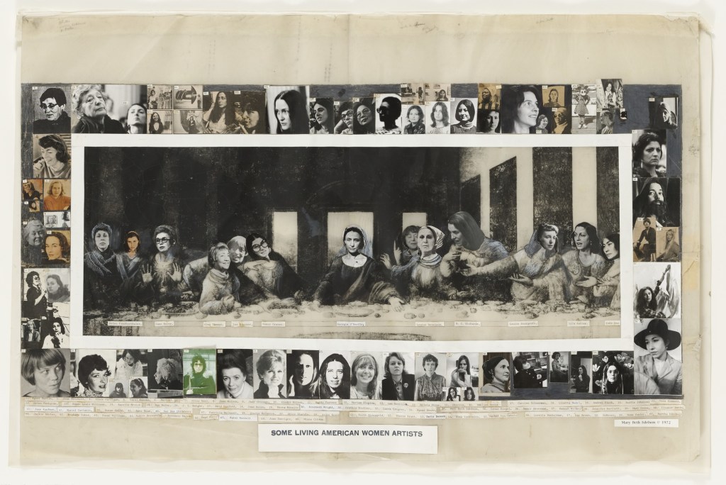
In Some Living American Women Artists (see fig. 1), Mary Beth Edelson replaced the heads of the figures in the Last Supper with female artists. The image of the Last Supper is still recognisable, the structure of the image is unchanged. Edelson has only added images of the heads of female artists in place of Christ and his disciples. When I first looked at this image, to me it appears to be drawing a comparison between the patriarchy in the art world with the patriarchy in religion. Edelson shows women in the roles of men, it represents how women struggle against tradition, expectation and inequality in their work and lives. It shows just a small amount of female artists there are, but they are often overlooked and dismissed. This is similar to what I am trying to do. I am attempting to look at the inequality in the art world by using a male dominated pilgrimage route. This artwork is influential to my work, as it has the same principles and aim behind it. Edelson also uses collage techniques to accomplish this, which is what I want to do. It also links religion and art together. This work is quite symbolic, Linda Aleci believes it “honors the ecumenical ideals of communion and community” (Aleci quoted in Greifen). Edelson compares the historical systematic omission of women in art and in aspects of religion. Edelson explains why she choose to challenge religion, as “the most negative aspect of organized religion, for me was the positioning of power and authority in the hands of a male hierarchy that intentionally excluded women from access to these positions…[The work] gave me a double pleasure of presenting the names and faces of the many women artists who were seldom seen in the art world of 1972 as ‘the grand subject’—while spoofing male exclusivity in the patriarchy” (Edelson quoted in Dang).
(Fig. 1. Some Living American Women Artists (1972))